Category
메인 카테고리 탭 아래에서 콘텐츠를 더욱 세분화하여 구분하는 하위 네비게이션 요소입니다. 사용자가 대분류에서 소분류로 자연스럽게 탐색할 수 있도록 돕고, 정보 구조를 명확하게 전달하는 역할을 합니다.
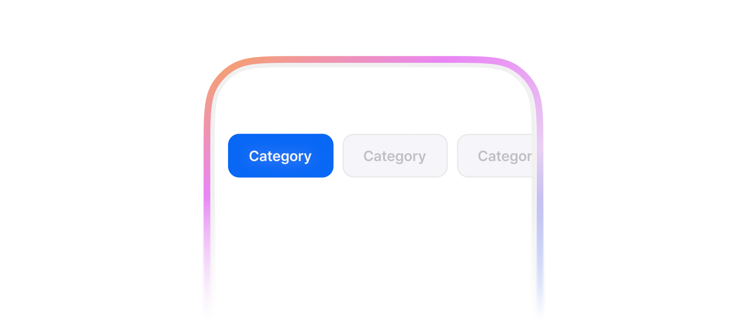
필터 개념으로 콘텐츠를 분류할 때 사용합니다.
import {
  Button,
  Category,
  CategoryList,
  CategoryListItem,
  CategoryPanel,
  Box,
} from '@wanteddev/wds';

const Demo = () => {
  return (
    <Category defaultValue="0">
      <CategoryList size="large" sx={{ width: '75%' }}>
        <CategoryListItem value="0">
          First
        </CategoryListItem>
        <CategoryListItem value="1">
          Second
        </CategoryListItem>
        <CategoryListItem value="2">
          Third
        </CategoryListItem>
        <CategoryListItem value="3">
          Fourth
        </CategoryListItem>
      </CategoryList>

      <CategoryPanel value="0">
        <Content>
          First content
        </Content>
      </CategoryPanel>
      <CategoryPanel value="1">
        <Content>
          Second content
        </Content>
      </CategoryPanel>
      <CategoryPanel value="2">
        <Content>
          Third content
        </Content>
      </CategoryPanel>
      <CategoryPanel value="3">
        <Content>
          Fourth content
        </Content>
      </CategoryPanel>
    </Category>
  )
}

const Content = ({ children }: React.PropsWithChildren) => {
  return (
    <Box sx={{ padding: '16px' }}>
      {children}
    </Box>
  )
}

export default Demo;Category 는 여러 컴포넌트를 조합해서 사용합니다.
기본 구성은 아래와 같습니다.
CategoryList 는 2가지 variant 를 사용할 수 있습니다.
- normal (default)
- alternative
import {
  Category,
  CategoryList,
  CategoryListItem,
  CategoryPanel,
  FlexBox
} from '@wanteddev/wds';

const Demo = () => {
  return (
    <FlexBox gap="24px" flexDirection="column" sx={{ width: '75%' }}>
      <Category defaultValue="0">
        <CategoryList variant="normal">
          <CategoryListItem value="0">
            First
          </CategoryListItem>
          <CategoryListItem value="1">
            Second
          </CategoryListItem>
          <CategoryListItem value="2">
            Third
          </CategoryListItem>
          <CategoryListItem value="3">
            Fourth
          </CategoryListItem>
        </CategoryList>
      </Category>
      <Category defaultValue="0">
        <CategoryList variant="alternative">
          <CategoryListItem value="0">
            First
          </CategoryListItem>
          <CategoryListItem value="1">
            Second
          </CategoryListItem>
          <CategoryListItem value="2">
            Third
          </CategoryListItem>
          <CategoryListItem value="3">
            Fourth
          </CategoryListItem>
        </CategoryList>
      </Category>
    </FlexBox>
  )
}

export default Demo;총 4가지 사이즈를 제공합니다.
- small
- medium
- large
- xlarge
import {
  Category,
  CategoryList,
  CategoryListItem,
  CategoryPanel,
  FlexBox,
} from '@wanteddev/wds';

const Demo = () => {
  return (
    <FlexBox gap="24px" flexDirection="column" sx={{ width: '75%' }}>
      <Category defaultValue="0">
        <CategoryList size="small">
          <CategoryListItem value="0">
            First
          </CategoryListItem>
          <CategoryListItem value="1">
            Second
          </CategoryListItem>
          <CategoryListItem value="2">
            Third
          </CategoryListItem>
          <CategoryListItem value="3">
            Fourth
          </CategoryListItem>
        </CategoryList>
      </Category>
      <Category defaultValue="0">
        <CategoryList size="medium">
          <CategoryListItem value="0">
            First
          </CategoryListItem>
          <CategoryListItem value="1">
            Second
          </CategoryListItem>
          <CategoryListItem value="2">
            Third
          </CategoryListItem>
          <CategoryListItem value="3">
            Fourth
          </CategoryListItem>
        </CategoryList>
      </Category>
      <Category defaultValue="0">
        <CategoryList size="large">
          <CategoryListItem value="0">
            First
          </CategoryListItem>
          <CategoryListItem value="1">
            Second
          </CategoryListItem>
          <CategoryListItem value="2">
            Third
          </CategoryListItem>
          <CategoryListItem value="3">
            Fourth
          </CategoryListItem>
        </CategoryList>
      </Category>
      <Category defaultValue="0">
        <CategoryList size="xlarge">
          <CategoryListItem value="0">
            First
          </CategoryListItem>
          <CategoryListItem value="1">
            Second
          </CategoryListItem>
          <CategoryListItem value="2">
            Third
          </CategoryListItem>
          <CategoryListItem value="3">
            Fourth
          </CategoryListItem>
        </CategoryList>
      </Category>
    </FlexBox>
  )
}

export default Demo;iconButton prop 으로 우측에 아이콘 버튼을 추가할 수 있습니다.
size별로 icon button 의 크기를 각각 지정해주어야 합니다.
- small: 20px
- medium: 22px
- large: 24px
- xlarge: 24px
import {
  Category,
  CategoryList,
  CategoryListItem,
  CategoryPanel,
  FlexBox,
  IconButton,
} from '@wanteddev/wds';
import { IconBlank } from '@wanteddev/wds-icon';

const Demo = () => {
  return (
    <FlexBox gap="24px" flexDirection="column" sx={{ width: '75%' }}>
      <Category defaultValue="0">
        <CategoryList
          size="small"
          iconButton={(
            <IconButton size={20}>
              <IconBlank />
            </IconButton>
          )}
        >
          <CategoryListItem value="0">
            First
          </CategoryListItem>
          <CategoryListItem value="1">
            Second
          </CategoryListItem>
          <CategoryListItem value="2">
            Third
          </CategoryListItem>
          <CategoryListItem value="3">
            Fourth
          </CategoryListItem>
        </CategoryList>
      </Category>
      <Category defaultValue="0">
        <CategoryList
          size="medium"
          iconButton={(
            <IconButton size={22}>
              <IconBlank />
            </IconButton>
          )}
        >
          <CategoryListItem value="0">
            First
          </CategoryListItem>
          <CategoryListItem value="1">
            Second
          </CategoryListItem>
          <CategoryListItem value="2">
            Third
          </CategoryListItem>
          <CategoryListItem value="3">
            Fourth
          </CategoryListItem>
        </CategoryList>
      </Category>
      <Category defaultValue="0">
        <CategoryList
          size="large"
          iconButton={(
            <IconButton size={24}>
              <IconBlank />
            </IconButton>
          )}
        >
          <CategoryListItem value="0">
            First
          </CategoryListItem>
          <CategoryListItem value="1">
            Second
          </CategoryListItem>
          <CategoryListItem value="2">
            Third
          </CategoryListItem>
          <CategoryListItem value="3">
            Fourth
          </CategoryListItem>
        </CategoryList>
      </Category>
      <Category defaultValue="0">
        <CategoryList
          size="xlarge"
          iconButton={(
            <IconButton size={24}>
              <IconBlank />
            </IconButton>
          )}
        >
          <CategoryListItem value="0">
            First
          </CategoryListItem>
          <CategoryListItem value="1">
            Second
          </CategoryListItem>
          <CategoryListItem value="2">
            Third
          </CategoryListItem>
          <CategoryListItem value="3">
            Fourth
          </CategoryListItem>
        </CategoryList>
      </Category>
    </FlexBox>
  )
}

export default Demo;아래 옵션으로 각각 padding 을 추가할 수 있습니다.
- horizontalPadding
- verticalPadding
import {
  Category,
  CategoryList,
  CategoryListItem,
  CategoryPanel,
  FlexBox,
} from '@wanteddev/wds';

const Demo = () => {
  return (
    <FlexBox flexDirection="column" gap="14px" sx={{ width: '75%' }}>
      <Category defaultValue="0">
        <CategoryList horizontalPadding>
          <CategoryListItem value="0">
            horizontalPadding1
          </CategoryListItem>
          <CategoryListItem value="1">
            horizontalPadding2
          </CategoryListItem>
          <CategoryListItem value="2">
            horizontalPadding3
          </CategoryListItem>
          <CategoryListItem value="3">
            horizontalPadding4
          </CategoryListItem>
        </CategoryList>
      </Category>

      <Category defaultValue="0">
        <CategoryList verticalPadding>
          <CategoryListItem value="0">
            verticalPadding1
          </CategoryListItem>
          <CategoryListItem value="1">
            verticalPadding2
          </CategoryListItem>
          <CategoryListItem value="2">
            verticalPadding3
          </CategoryListItem>
          <CategoryListItem value="3">
            verticalPadding4
          </CategoryListItem>
        </CategoryList>
      </Category>
    </FlexBox>
  )
}

export default Demo;disableScrollMoveOnChange prop 을 사용하면 카테고리 변경 시 스크롤이 이동하지 않습니다.
import {
  Category,
  CategoryList,
  CategoryListItem,
  CategoryPanel,
} from '@wanteddev/wds';

const Demo = () => {
  return (
    <Category defaultValue="0" disableScrollMoveOnChange>
      <CategoryList sx={{ width: '75%' }}>
        <CategoryListItem value="0">
          First
        </CategoryListItem>
        <CategoryListItem value="1">
          Second
        </CategoryListItem>
        <CategoryListItem value="2">
          Third
        </CategoryListItem>
        <CategoryListItem value="3">
          Fourth
        </CategoryListItem>
        <CategoryListItem value="4">
          Fifth
        </CategoryListItem>
        <CategoryListItem value="5">
          Sixth
        </CategoryListItem>
        <CategoryListItem value="6">
          Seventh
        </CategoryListItem>
        <CategoryListItem value="7">
          Eighth
        </CategoryListItem>
        <CategoryListItem value="8">
          Ninth
        </CategoryListItem>
        <CategoryListItem value="9">
          Tenth
        </CategoryListItem>
      </CategoryList>
    </Category>
  )
}

export default Demo;WAI-ARIA Tabs Pattern 을 준수합니다.
viewport에 따라 아래 옵션을 override 할 수 있습니다.
- size
- horizontalPadding
- verticalPadding
CategoryPanel 은 성능 최적화를 위해 마운트 모드를 설정할 수 있습니다.
only-active는 활성화 상태일 때만 렌더링 되며 상태가 변경되는 경우 언마운트 됩니다.force-mount는 활성화 상태일 때 렌더링 되며 상태가 변경되는 경우 언마운트되지 않고 숨김 처리 됩니다.always는 항상 렌더링 되어 있으며 상태가 변경되는 경우 언마운트되지 않고 숨김 처리 됩니다.