Text area
필드 내부에 2줄 이상의 텍스트를 입력할 때 사용하며 Heading, Placeholder, Description등의 요소를 활용하여 사용자가 입력할 내용의 형식을 보다 명확하게 안내합니다.
TextArea 는 입력한 텍스트에 따라 자동으로 높이가 늘어나는 컴포넌트입니다.
import { TextArea } from '@wanteddev/wds';

const Demo = () => {
  return (
    <TextArea width="25ch" placeholder="Basic text area" defaultValue="자동으로 높이가 계속해서 늘어나요." />
  )
}

export default Demo;minRows, maxRows prop 으로 최대 / 최소로 늘어나는 line 수를 정할 수 있습니다.
import { TextArea } from '@wanteddev/wds';

const Demo = () => {
  return (
    <TextArea
      width="25ch"
      placeholder="Min/Max rows"
      minRows={3}
      maxRows={4} />
  )
}

export default Demo;validation 을 통해 여러 상태를 표현할 수 있습니다.
- default
- invalid (negative)
- readOnly
- disabled
import { FlexBox, TextArea } from '@wanteddev/wds';

const Demo = () => {
  return (
    <FlexBox gap="12px" flexDirection="column" alignItems="center">
      <TextArea width="25ch" placeholder="Default" />
      <TextArea width="25ch" placeholder="Invalid" invalid />
      <TextArea width="25ch" placeholder="Read Only" readOnly />
      <TextArea width="25ch" placeholder="Disabled" disabled />
    </FlexBox>
  )
}

export default Demo;Form과 관련된 컴포넌트와 함께 사용할 수 있습니다.
FormFieldFormControlFormLabelFormMessageFormErrorMessage
import { FlexBox, FormField, FormControl, FormLabel, FormMessage, FormErrorMessage, TextArea } from '@wanteddev/wds';

const Demo = () => {
  return (
    <FlexBox gap="12px" flexDirection="column" alignItems="center">
      <FormField>
        <FormLabel required>Label</FormLabel>
        <FormControl>
          <TextArea width="25ch" placeholder="Form field" />
        </FormControl>
        <FormMessage>Helper Message</FormMessage>
      </FormField>

      <FormField>
        <FormLabel required>Label</FormLabel>
        <FormControl>
          <TextArea width="25ch" placeholder="Invalid form field" invalid />
        </FormControl>
        <FormErrorMessage>Error Message</FormErrorMessage>
      </FormField>
    </FlexBox>
  )
}
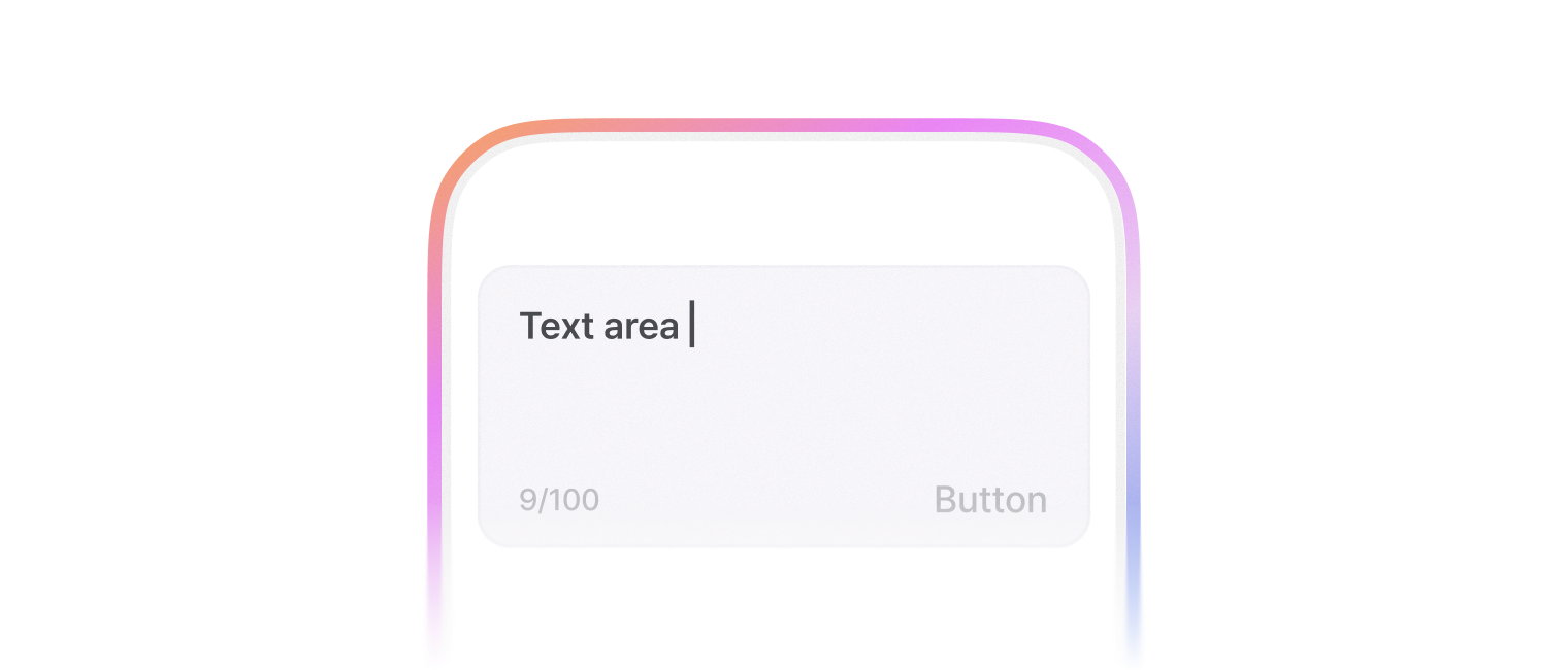
export default Demo;leadingContent, trailingContent prop 을 사용하여 하단 앞/뒤에 컨텐츠를 추가할 수 있습니다.
해당 옵션을 사용할 때에는 TextAreaContent 로 감싸서 사용합니다.
import { FlexBox, TextArea, TextAreaContent, ContentBadge, FilterButton, IconButton, TextButton } from '@wanteddev/wds';
import { IconBlank, IconCopy, IconSendFill } from '@wanteddev/wds-icon';

const Demo = () => {
  return (
    <FlexBox gap="12px" flexDirection="column" alignItems="center" sx={{ width: '100%' }}>
      <TextArea
        width="45%"
        placeholder="Icon"
        leadingContent={(
          <TextAreaContent variant="icon">
            <IconBlank />
          </TextAreaContent>
        )}
        trailingContent={(
          <TextAreaContent variant="icon">
            <IconBlank />
          </TextAreaContent>
        )}
      />
      <TextArea
        width="45%"
        placeholder="Chip"
        leadingContent={(
          <TextAreaContent variant="chip">
            <FilterButton size="small">
              Chip
            </FilterButton>
          </TextAreaContent>
        )}
        trailingContent={(
          <TextAreaContent variant="chip">
            <FilterButton size="small">
              Chip
            </FilterButton>
          </TextAreaContent>
        )}
      />
      <TextArea
        width="45%"
        placeholder="Badge"
        leadingContent={(
          <TextAreaContent variant="badge">
            <ContentBadge size="small" color="neutral">
              Badge
            </ContentBadge>
          </TextAreaContent>
        )}
        trailingContent={(
          <TextAreaContent variant="badge">
            <ContentBadge size="small" color="neutral">
              Badge
            </ContentBadge>
          </TextAreaContent>
        )}
      />
      <TextArea
        width="45%"
        placeholder="Button"
        leadingContent={(
          <TextAreaContent variant="button">
            <TextButton size="small" color="assistive">
              Button
            </TextButton>
          </TextAreaContent>
        )}
        trailingContent={(
          <TextAreaContent variant="button">
            <TextButton size="small">
              Button
            </TextButton>
          </TextAreaContent>
        )}
      />
      <TextArea
        width="45%"
        placeholder="Character counter"
        leadingContent={(
          <TextAreaContent variant="characterCounter">
            2000
          </TextAreaContent>
        )}
        trailingContent={(
          <TextAreaContent variant="characterCounter">
            2000
          </TextAreaContent>
        )}
      />
      <TextArea
        width="45%"
        placeholder="Icon button"
        leadingContent={(
          <TextAreaContent variant="icon-button">
            <IconButton variant="normal">
              <IconCopy />
            </IconButton>
          </TextAreaContent>
        )}
        trailingContent={(
          <TextAreaContent variant="icon-button">
            <IconButton variant="solid" size="small">
              <IconSendFill />
            </IconButton>
          </TextAreaContent>
        )}
      />
    </FlexBox>
  )
}

export default Demo;기본적으로 비제어 컴포넌트로 동작합니다.
value, onChange prop 을 사용하면 제어 컴포넌트로 동작합니다.
제어 컴포넌트와 비제어 컴포넌트는 React 공식 문서 를 참조해주세요.
import { FlexBox, TextArea } from '@wanteddev/wds';
import { useState } from 'react';

const Demo = () => {
  const [value, setValue] = useState('');

  return (
    <FlexBox alignItems="center" flexDirection="column" gap="12px">
      <TextArea
        defaultValue="Uncontrolled"
        placeholder="Uncontrolled"
        width="25ch"
      />
      <TextArea
        value={value}
        onChange={(e) => setValue(e.target.value)}
        placeholder="Controlled"
        width="25ch"
      />
    </FlexBox>
  )
}

export default Demo;react-hook-form 과 유연하게 조합해서 사용할 수 있습니다.
import { Button, FlexBox, TextArea, TextAreaContent, FormField, FormControl, FormLabel, FormErrorMessage, FormMessage } from '@wanteddev/wds';
import { useForm, Controller } from 'react-hook-form';

const Demo = () => {
  const form = useForm();

  return (
    <FlexBox
      as="form"
      flexDirection="column"
      alignItems="center"
      justifyContent="center"
      gap="20px"
      onSubmit={form.handleSubmit((v) => alert(JSON.stringify(v)))}
    >
      <Controller
        control={form.control}
        name="content"
        rules={{
          required: {
            value: true,
            message: "필수 값입니다.",
          },
          maxLength: 20,
        }}
        render={({ field, formState }) => (
          <FormField>
            <FormLabel required>내용</FormLabel>

            <FormControl>
              <TextArea
                {...field}
                placeholder="입력하세요."
                width="300px"
                invalid={Boolean(formState.errors.content)}
                trailingContent={(
                  <TextAreaContent variant="characterCounter">
                    20
                  </TextAreaContent>
                )}
              />
            </FormControl>

            {!!formState.errors.content ? (
              <FormErrorMessage>{formState.errors.content?.message?.toString()}</FormErrorMessage>
            ) : (
              <FormMessage>내용을 입력하세요.</FormMessage>
            )}
          </FormField>
        )}
      />

      <Button type="submit" fullWidth>제출</Button>
    </FlexBox>
  )
}

export default Demo;