Switch
선택된 항목을 시각적으로 강조 되는 형태의 구조로 같은 콘텐츠 영역 내에서 보기 방식이나 필터를 변경할 때 사용될 수 있습니다.
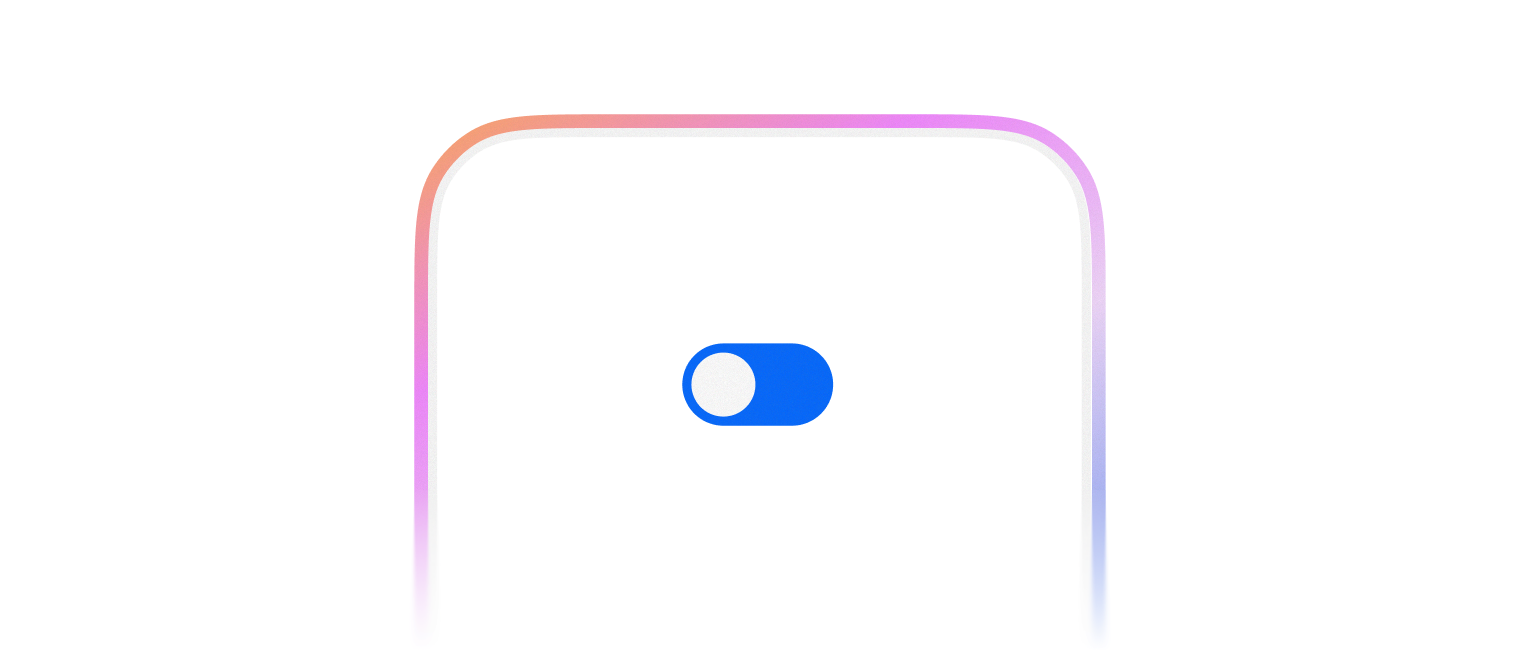
기본적으로 켜거나 끌 수 있는 기능을 표시할 때 사용합니다.
import { Switch } from '@wanteddev/wds';

const Demo = () => {
  return (
    <Switch />
  )
}

export default Demo;2가지 크기를 제공합니다.
- small
- medium (default)
import { FlexBox, Switch } from '@wanteddev/wds';

const Demo = () => {
  return (
    <FlexBox flexDirection="column" gap="8px">
      <Switch size="small" />
      <Switch size="medium" />
    </FlexBox>
  )
}

export default Demo;Form과 관련된 컴포넌트와 함께 사용할 수 있습니다.
FormFieldFormControlFormLabelFormMessageFormErrorMessage
import { FlexBox, FormField, FormControl, FormLabel, FormMessage, Switch } from '@wanteddev/wds';

const Demo = () => {
  return (
    <FlexBox flexDirection="column" gap="8px">
      <FormField>
        <FormLabel required>알림 설정</FormLabel>
        <FormControl>
          <Switch />
        </FormControl>
        <FormMessage>Helper Message</FormMessage>
      </FormField>
    </FlexBox>
  )
}

export default Demo;기본적으로 비제어 컴포넌트로 동작합니다.
checked, onCheckedChange prop 을 사용하면 제어 컴포넌트로 동작합니다.
제어 컴포넌트와 비제어 컴포넌트는 React 공식 문서 를 참조해주세요.
import { FlexBox, Switch } from '@wanteddev/wds';
import { useState } from 'react';

const Demo = () => {
  const [checked, setChecked] = useState(true);

  return (
    <FlexBox flexDirection="column" gap="8px">
      <Switch defaultChecked={false} />
      <Switch checked={checked} onCheckedChange={setChecked} />
    </FlexBox>
  )
}

export default Demo;WAI-ARIA Switch Pattern 을 준수합니다.
- Form Field 와 함께 사용할 때 모든 접근성 속성을 주입할 수 있습니다.
- 그렇지 않은 경우에는 직접
aria-label등을 사용해서 접근성을 충족시켜야 합니다.