Skeleton
실제 콘텐츠를 불러오는 동안 해당 영역의 레이아웃 형태를 임시로 보여줍니다. 데이터가 로딩되고 있음을 직관적으로 인지할 수 있도록 돕고, 콘텐츠가 갑자기 나타날 때 발생할 수 있는 화면 깜빡임을 방지합니다.
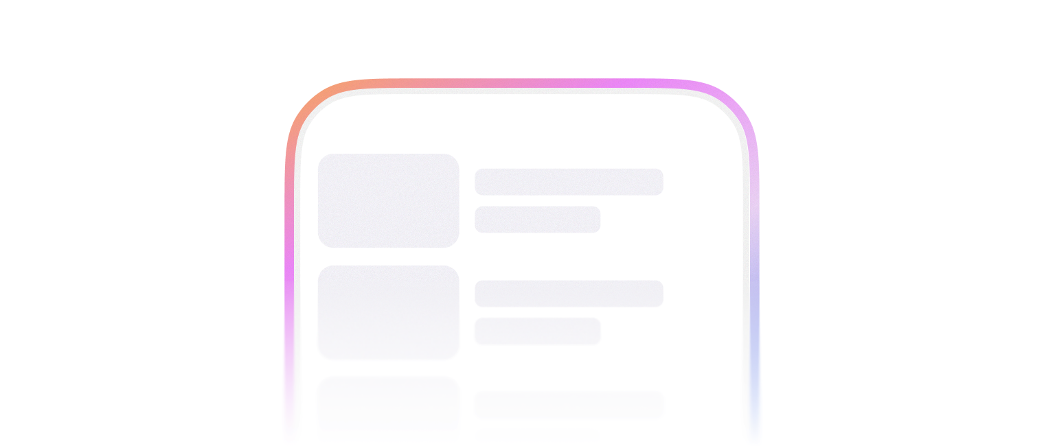
자리를 일시적으로 표시할 때 사용합니다.
import { Skeleton } from '@wanteddev/wds';

const Demo = () => {
  return (
    <Skeleton width="75%" align="center" />
  )
}

export default Demo;3가지 variant를 사용할 수 있습니다.
textrectanglecircle
텍스트 자리를 일시적으로 표시할 때 사용합니다.
- 상/하 padding 값이 포함되어 높이를 차지합니다.
text에서만alignprop으로 가로 정렬을 조정할 수 있습니다.
import { Skeleton, FlexBox } from '@wanteddev/wds';

const Demo = () => {
  return (
    <FlexBox gap="24px" flexDirection="column" sx={{ width: '75%' }} alignItems="center">
      <FlexBox flexDirection="column" gap="16px" sx={{ width: '100%' }}>
        <Skeleton align="left" />
        <Skeleton width="75%" align="left" />
        <Skeleton width="50%" align="left" />
        <Skeleton width="25%" align="left" />
      </FlexBox>
      <FlexBox flexDirection="column" gap="16px" sx={{ width: '100%' }}>
        <Skeleton align="center" />
        <Skeleton width="75%" align="center" />
        <Skeleton width="50%" align="center" />
        <Skeleton width="25%" align="center" />
      </FlexBox>
      <FlexBox flexDirection="column" gap="16px" sx={{ width: '100%' }}>
        <Skeleton align="right" />
        <Skeleton width="75%" align="right" />
        <Skeleton width="50%" align="right" />
        <Skeleton width="25%" align="right" />
      </FlexBox>
    </FlexBox>
  )
}

export default Demo;네모난 모양을 가진 자리에 사용합니다.
import { Skeleton } from '@wanteddev/wds';

const Demo = () => {
  return (
    <Skeleton variant="rectangle" width="64px" height="64px" />
  )
}

export default Demo;동그란 모양을 가진 자리에 사용합니다.
import { Skeleton } from '@wanteddev/wds';

const Demo = () => {
  return (
    <Skeleton variant="circle" width="64px" height="64px" />
  )
}

export default Demo;color, opacity prop으로 색상과 투명도를 조정할 수 있습니다.
import { Skeleton } from '@wanteddev/wds';

const Demo = () => {
  return (
    <Skeleton
      color="semantic.label.normal"
      opacity="opacity.61"
    />
  )
}

export default Demo;variant가 rectangle과 text일 때 radius prop으로 border radius를 조정할 수 있습니다.
import { Skeleton } from '@wanteddev/wds';

const Demo = () => {
  return (
    <Skeleton radius="24px" variant="rectangle" width="75%" height="24px" />
  )
}

export default Demo;기본적으로 2초 동안 지속되는 애니메이션이 무한 반복됩니다.
animation={false} 로 애니메이션을 종료할 수 있습니다.
import { Skeleton } from '@wanteddev/wds';

const Demo = () => {
  return (
    <Skeleton align="center" width="75%" animation={false} />
  )
}

export default Demo;정해진 breakpoint에 따라 아래 옵션을 override 할 수 있습니다.
- width
- height