Section header
콘텐츠 영역이나 특정 섹션의 시작을 명확하게 알려주는 제목 요소입니다. 섹션의 주제를 설명하고 추가 정보나 관련 페이지로 이동할 수 있는 링크를 함께 제공하여 탐색을 쉽게 할 수 있도록 돕습니다.
섹션의 주제를 설명하는 헤더 영역으로 사용합니다.
import { SectionHeader } from '@wanteddev/wds';

const Demo = () => {
  return (
    <SectionHeader sx={{ width: '75%' }}>
      Section header
    </SectionHeader>
  )
}
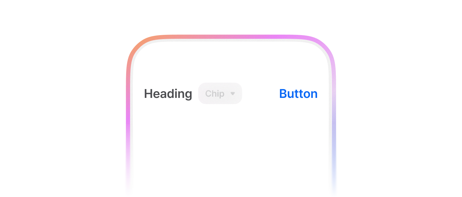
export default Demo;headingContent, trailingContent 옵션을 통해 컨텐츠를 추가할 수 있어요.
import { SectionHeader, TextButton, FilterButton } from '@wanteddev/wds';

const Demo = () => {
  return (
    <SectionHeader
      sx={{ width: '75%' }}
      headingContent={(
        <FilterButton size="small" variant="outlined">Filter chip</FilterButton>
      )}
      trailingContent={(
        <TextButton color="assistive" size="small">Text button</TextButton>
      )}
    >
      Section header
    </SectionHeader>
  )
}

export default Demo;SectionHeaderNavigation 컴포넌트를 사용하여 Carousel 등의 탐색을 도와줄 수 있어요.
import { SectionHeader, SectionHeaderNavigation, SectionHeaderNavigationButton } from '@wanteddev/wds';
import { IconChevronLeftSmall, IconChevronRightSmall } from '@wanteddev/wds-icon';

const Demo = () => {
  return (
    <SectionHeader
      sx={{ width: '75%' }}
      trailingContent={(
        <SectionHeaderNavigation>
          <SectionHeaderNavigationButton>
            <IconChevronLeftSmall />
          </SectionHeaderNavigationButton>
          <SectionHeaderNavigationButton>
            <IconChevronRightSmall />
          </SectionHeaderNavigationButton>
        </SectionHeaderNavigation>
      )}
    >
      Section header
    </SectionHeader>
  )
}

export default Demo;platform, size 옵션을 통해 내부 콘텐츠의 간격 및 크기를 조정할 수 있습니다.
- platform
- desktop (default)
- mobile
- size
- xsmall
- small
- medium (default)
- large
import { SectionHeader, FlexBox } from '@wanteddev/wds';

const Demo = () => {
  return (
    <FlexBox gap="12px" flexDirection="column" alignItems="center" sx={{ width: '75%' }}>
      <SectionHeader platform="desktop" size="xsmall">
        XSmall Section header
      </SectionHeader>
      <SectionHeader platform="desktop" size="small">
        Small Section header
      </SectionHeader>
      <SectionHeader platform="desktop" size="medium">
        Medium Section header
      </SectionHeader>
      <SectionHeader platform="desktop" size="large">
        Large Section header
      </SectionHeader>
    </FlexBox>
  )
}

export default Demo;import { SectionHeader, FlexBox } from '@wanteddev/wds';
const Demo = () => {
return (
<FlexBox gap="12px" flexDirection="column" alignItems="center" sx={{ width: '75%' }}>
<SectionHeader platform="mobile" size="xsmall">
XSmall Section header
</SectionHeader>
<SectionHeader platform="mobile" size="small">
Small Section header
</SectionHeader>
<SectionHeader platform="mobile" size="medium">
Medium Section header
</SectionHeader>
<SectionHeader platform="mobile" size="large">
Large Section header
</SectionHeader>
</FlexBox>
)
}
export default Demo;정해진 breakpoint에 따라 아래 옵션을 override 할 수 있습니다.
- platform
- size