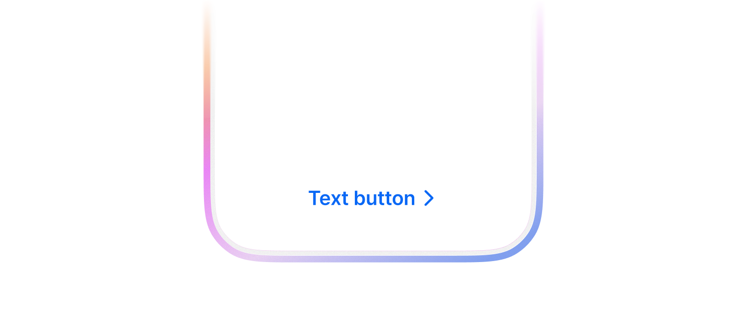
Text button
배경이나 테두리 없이 텍스트 라벨만으로 구성된 버튼으로 사용자의 행동을 유도합니다. 시각적 소음을 줄이고 싶거나, 우선순위가 낮은 보조 액션을 제공할 때 주로 사용합니다.
TextButton 은 2가지 색상을 사용할 수 있습니다.
- primary (default)
- assistive
import { FlexBox, TextButton } from '@wanteddev/wds';

const Demo = () => {
  return (
    <FlexBox gap="12px" justifyContent="center">
      <TextButton color="primary">Primary</TextButton>
      <TextButton color="assistive">Assistive</TextButton>
    </FlexBox>
  )
}

export default Demo;leadingContent, trailingContent 를 사용해서 아이콘과 함께 사용할 수 있습니다.
import { FlexBox, TextButton } from '@wanteddev/wds';
import { IconPlus, IconTrash } from '@wanteddev/wds-icon';

const Demo = () => {
  return (
    <FlexBox gap="12px" justifyContent="center">
      <TextButton
        color="primary"
        leadingContent={<IconPlus />}
      >
        추가
      </TextButton>
      <TextButton
        color="assistive"
        trailingContent={<IconTrash />}
      >
        삭제
      </TextButton>
    </FlexBox>
  )
}

export default Demo;2가지 사이즈를 제공합니다.
- small
- medium (default)
import { TextButton, FlexBox } from '@wanteddev/wds';

const Demo = () => {
  return (
    <FlexBox gap="12px" flexDirection="column" alignItems="center">
      <FlexBox gap="12px" alignItems="center">
        <TextButton color="primary" size="small">
          Small
        </TextButton>
        <TextButton color="primary" size="medium">
          Medium
        </TextButton>
      </FlexBox>

      <FlexBox gap="12px" alignItems="center">
        <TextButton color="assistive" size="small">
          Small
        </TextButton>
        <TextButton color="assistive" size="medium">
          Medium
        </TextButton>
      </FlexBox>
    </FlexBox>
  )
}

export default Demo;loading 옵션을 통해 로딩 상태를 트리거 할 수 있습니다.
disabled 상태와는 다르게 동작하며 아래 이벤트 실행을 막습니다.
onClickonMouseDownonPointerDownonKeyDown (e.key === 'Enter' || e.key === ' ')
이벤트 실행을 막지 않으려면 disableLoadingPreventEvents 을 사용할 수 있습니다.
import { TextButton, FlexBox } from '@wanteddev/wds';
import { useState, useEffect } from 'react';

const Demo = () => {
  const [loading, setLoading] = useState(true);

  useEffect(() => {
    const interval = setInterval(() => {
      setLoading(prev => !prev)
    }, 3000);

    return () => clearInterval(interval);
  }, [])

  return (
    <FlexBox gap="12px" justifyContent="center">
      <TextButton color="primary" loading={loading}>
        제출
      </TextButton>
    </FlexBox>
  )
}

export default Demo;as 옵션을 통해 Link 등 다른 컴포넌트/태그로 활용할 수 있습니다.
정해진 breakpoint에 따라 아래 옵션을 override 할 수 있습니다.
- size