Text button

배경이나 테두리 없이 텍스트 라벨만으로 구성된 버튼으로 사용자의 행동을 유도합니다. 시각적 소음을 줄이고 싶거나, 우선순위가 낮은 보조 액션을 제공할 때 주로 사용합니다.

@MainActor struct TextButton

Overview

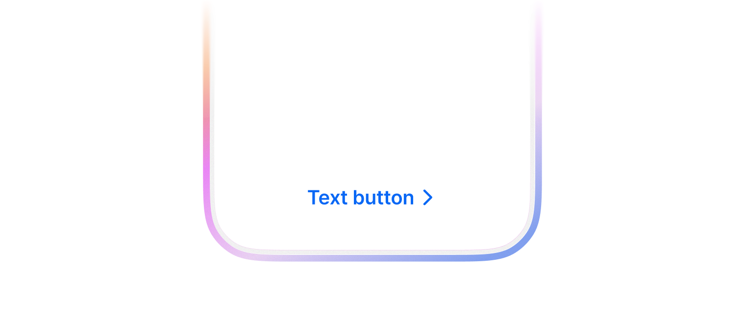
Text만 있는 스타일의 버튼으로, 가벼운 액션이나 링크 형태의 액션에 적합합니다.

TextButton(text: "더 보기", handler: { showMore() })
TextButton(color: .assistive, text: "상세보기", trailingIcon: .chevronRight)

Topics

Initializers

init(color: Color, size: Size, text: String, leadingIcon: Icon?, trailingIcon: Icon?, handler: (() -> Void)?)

Text 스타일의 버튼을 생성합니다.

  • Parameters
    ParameterDescription
    color버튼의 스타일, 생략하면 기본값으로 .primary 적용
    size버튼의 크기, 생략하면 기본값으로 .medium 적용
    text버튼에 표시할 텍스트
    leadingIcon텍스트 앞에 표시할 아이콘, 생략하면 기본값으로 nil 적용
    trailingIcon텍스트 뒤에 표시할 아이콘, 생략하면 기본값으로 nil 적용
    handler버튼 탭 시 실행할 핸들러, 생략하면 기본값으로 nil 적용

Instance Properties

var body: some View

뷰의 내용과 동작을 정의합니다.

Instance Methods

func contentColor(SwiftUI.Color?) -> TextButton

버튼 콘텐츠(텍스트와 아이콘)의 색상을 설정합니다.

  • Parameters

    ParameterDescription
    contentColor설정할 색상
  • Return Value

    수정된 버튼 인스턴스

  • Discussion

    TextButton(text: "복사")
        .contentColor(.red)
    
func disable(Bool) -> TextButton

버튼을 비활성화 상태로 설정합니다.

  • Parameters

    ParameterDescription
    disable비활성화 여부, 생략하면 기본값으로 true 적용
  • Return Value

    수정된 버튼 인스턴스

  • Discussion

    비활성화된 버튼은 시각적으로 흐리게 표시되며 사용자 상호작용에 반응하지 않습니다.

    TextButton(text: "저장")
        .disable(isFormInvalid)
    
func fill(horizontal: Bool, vertical: Bool) -> TextButton

버튼이 수평 또는 수직 방향으로 공간을 채우도록 설정합니다.

  • Parameters

    ParameterDescription
    fillHorizontal수평 방향 채우기 여부, 생략하면 기본값으로 false 적용
    fillVertical수직 방향 채우기 여부, 생략하면 기본값으로 false 적용
  • Return Value

    수정된 버튼 인스턴스

  • Discussion

    버튼의 크기를 조절하여 컨테이너 뷰의 공간을 효율적으로 활용할 때 사용합니다.

    // 부모 뷰의 가로 너비를 모두 채우는 버튼
    TextButton(text: "전체 확인")
        .fill(horizontal: true)
    
    // 가로, 세로 모두 채우는 버튼
    TextButton(text: "영역 전체 채우기")
        .fill(horizontal: true, vertical: true)
    
func fontVariant(Typography.Variant?) -> TextButton

버튼 텍스트의 폰트 변형을 설정합니다.

  • Parameters

    ParameterDescription
    fontVariant설정할 폰트 변형
  • Return Value

    수정된 버튼 인스턴스

  • Discussion

    텍스트의 크기와 스타일을 변경할 때 사용합니다.

    TextButton(text: "중요 안내")
        .fontVariant(.heading)
    
func fontWeight(Typography.Weight?) -> TextButton

버튼 텍스트의 폰트 두께를 설정합니다.

  • Parameters

    ParameterDescription
    fontWeight설정할 폰트 두께
  • Return Value

    수정된 버튼 인스턴스

  • Discussion

    텍스트의 강조를 조절할 때 사용합니다.

    TextButton(text: "중요 공지")
        .fontWeight(.bold)
    
func loading(Bool) -> TextButton

버튼을 로딩 상태로 설정합니다.

  • Parameters

    ParameterDescription
    loading로딩 상태 여부, 생략하면 기본값으로 true 적용
  • Return Value

    수정된 버튼 인스턴스

  • Discussion

    로딩 상태인 버튼은 내부 콘텐츠 대신 로딩 인디케이터를 표시하며 사용자 상호작용에 반응하지 않습니다. 비동기 작업이 진행 중일 때 사용자에게 피드백을 제공하는 데 유용합니다.

    TextButton(text: "저장")
        .loading(isLoading)
    

Enumerations

enum Color

Text 버튼의 색상 스타일을 정의합니다.

Enumeration Cases

case assistive

보조 스타일 - 중요도가 낮은 텍스트 링크에 사용

case primary

기본 강조 스타일 - 브랜드 컬러를 텍스트에 사용

Initializers

init?(rawValue: String)
enum Size

Text 스타일 버튼의 크기를 정의합니다.

Enumeration Cases

case medium

중간 크기

case small

작은 크기

Initializers

init?(rawValue: String)

Relationships

Conforms To

Swift.Sendable

SwiftUICore.View

© 2026 Wanted Lab, Inc.