Framed style
여러 요소를 하나의 프레임으로 감싸 정보의 그룹화를 명확히 하기 위한 컴포넌트입니다. 그룹 단위의 선택된 상태를 시각적으로 강조하기 위해 사용합니다.
Sx Prop 혹은 css 내부에서 사용 가능합니다.
import { Box, framedStyle } from '@wanteddev/wds';

const Demo = () => {
  return (
    <Box
      tabIndex={0}
      sx={framedStyle()}
    >
      <Placeholder />
    </Box>
  )
}

const Placeholder = () => {
  return (
    <Box
      sx={theme => ({
        width: 100,
        height: 40,
        backgroundColor: theme.semantic.accent.background.violet,
        opacity: theme.opacity[8]
      })}
    />
  )
}

export default Demo;small, medium(Default), large, xlarge 4개의 사이즈를 제공합니다.
사이즈에 따라 아래 속성들이 변경됩니다.
borderRadiuspadding
import { Box, framedStyle, FlexBox } from '@wanteddev/wds';

const Demo = () => {
  return (
    <FlexBox flexWrap="wrap" gap={12} alignItems="center">
      <Box
        tabIndex={0}
        sx={framedStyle({
          size: 'small',
        })}
      >
        <Placeholder />
      </Box>
      <Box
        tabIndex={0}
        sx={framedStyle({
          size: 'medium',
        })}
      >
        <Placeholder />
      </Box>
      <Box
        tabIndex={0}
        sx={framedStyle({
          size: 'large',
        })}
      >
        <Placeholder />
      </Box>
      <Box
        tabIndex={0}
        sx={framedStyle({
          size: 'xlarge',
        })}
      >
        <Placeholder />
      </Box>
    </FlexBox>
  )
}

const Placeholder = () => {
  return (
    <Box
      sx={theme => ({
        width: 100,
        height: 40,
        backgroundColor: theme.semantic.accent.background.violet,
        opacity: theme.opacity[8]
      })}
    />
  )
}
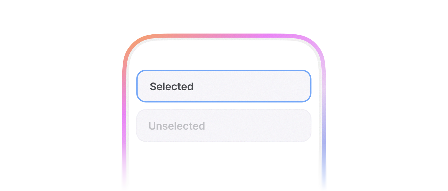
export default Demo;아래 옵션을 이용하여 다양한 상태를 표현할 수 있습니다.
selectedinvaliddisabled
import { Box, framedStyle, FlexBox, SegmentedControl, SegmentedControlItem } from '@wanteddev/wds';
import { useState } from 'react';

const Demo = () => {
  const [status, setStatus] = useState('normal');

  const selected = status === 'selected';
  const invalid = status === 'negative';
  const disabled = status === 'disabled';

  return (
    <FlexBox flexDirection="column" gap={24} sx={{ width: '100%' }} justifyContent="center">
      <Box
        tabIndex={disabled ? -1 : 0}
        sx={[
          framedStyle({
            size: 'small',
            selected,
            invalid,
            disabled
          }),
          {
            width: '100%',
          }
        ]}
      >
        <Placeholder />
      </Box>

      <SegmentedControl
        value={status}
        onValueChange={setStatus}
      >
        <SegmentedControlItem value="normal">Normal</SegmentedControlItem>
        <SegmentedControlItem value="selected">Selected</SegmentedControlItem>
        <SegmentedControlItem value="negative">Negative</SegmentedControlItem>
        <SegmentedControlItem value="disabled">Disabled</SegmentedControlItem>
      </SegmentedControl>
    </FlexBox>
  )
}

const Placeholder = () => {
  return (
    <Box
      sx={theme => ({
        width: '100%',
        height: 60,
        backgroundColor: theme.semantic.accent.background.violet,
        opacity: theme.opacity[8]
      })}
    />
  )
}

export default Demo;shadow 옵션을 사용하여 시스템 컬러 토큰에 정의된 shadow를 변경할 수 있습니다.
import { Box, framedStyle, FlexBox } from '@wanteddev/wds';

const Demo = () => {
  return (
    <FlexBox flexWrap="wrap" gap={12} alignItems="center">
      <Box
        tabIndex={0}
        sx={framedStyle({
          shadow: 'semantic.elevation.shadow.normal.small',
        })}
      >
        <Placeholder />
      </Box>
      <Box
        tabIndex={0}
        sx={framedStyle({
          shadow: 'semantic.elevation.shadow.normal.medium',
        })}
      >
        <Placeholder />
      </Box>
      <Box
        tabIndex={0}
        sx={framedStyle({
          shadow: 'semantic.elevation.shadow.normal.large',
        })}
      >
        <Placeholder />
      </Box>
      <Box
        tabIndex={0}
        sx={framedStyle({
          shadow: 'semantic.elevation.shadow.normal.xlarge',
        })}
      >
        <Placeholder />
      </Box>
    </FlexBox>
  )
}

const Placeholder = () => {
  return (
    <Box
      sx={theme => ({
        width: 100,
        height: 40,
        backgroundColor: theme.semantic.accent.background.violet,
        opacity: theme.opacity[8]
      })}
    />
  )
}

export default Demo;