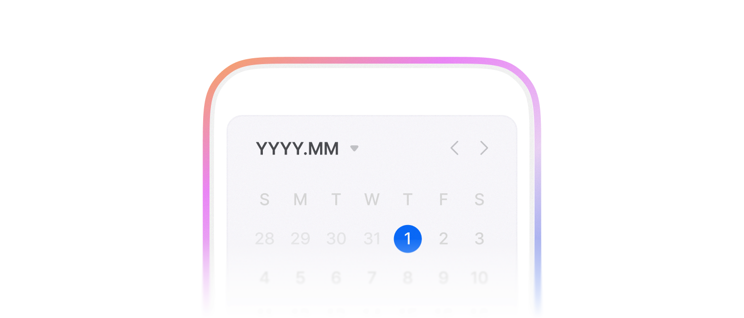
Date picker
캘린더를 통해 특정 날짜를 선택할 수 있게 해주는 요소로 월 단위 탐색, 연도 선택, 오늘 날짜 표시 등의 기능을 제공하며, 날짜 형식 오류를 방지하고 일관된 데이터 입력을 보장합니다.
사용자가 YYYY. MM. DD순으로 날짜를 입력할 수 있는 폼을 제공합니다.
- locale, timezone을 지정할 수 있습니다.
- 기본적으로 TextField 컴포넌트를 사용합니다.
- 항상 유효한 Date 값을 가지고 있지는 않아요. Invalid date 상태를 가질 수 있습니다.
import { DatePicker } from '@wanteddev/wds';

const Demo = () => {
  return (
    <DatePicker width="40%" />
  )
}

export default Demo;날짜가 표시되는 format 을 지정할 수 있습니다. 아래 format을 모두 사용할 수 있습니다.
- YYYY, YY
- M, MM, MMM, MMMM
- D, DD
- H, HH, h, hh
- m, mm
- s, ss
- A, a
import { DatePicker, FlexBox } from '@wanteddev/wds';

const Demo = () => {
  return (
    <FlexBox flexDirection="column" alignItems="center" gap="20px" sx={{ width: '100%' }}>
      <DatePicker format="MMMM.DD" width="40%" />

      <DatePicker format="MM/YYYY" width="40%" />

      <DatePicker format="YYYY-MM-DD" width="40%" />
    </FlexBox>
  )
}

export default Demo;- Locale
- 기본적으로 locale은
ko-KR으로 지정되어 있습니다. - Intl API 에서 지원하는 언어를 모두 import 없이 사용할 수 있습니다.
- 기본적으로 locale은
- Timezone
- 기본적으로 timezone은 사용자의 환경에 따라 결정돼요.
- dayjs 에서 지원하는 timezone과
UTC를 모두 import 없이 사용할 수 있습니다.
import { DatePicker, FlexBox } from '@wanteddev/wds';

const Demo = () => {
  return (
    <FlexBox flexDirection="column" alignItems="center" gap="20px" sx={{ width: '100%' }}>
      <DatePicker format="MMM/DD hh:mm:ss" width="40%" defaultValue={new Date()} locale="ko-KR" timezone="Asia/Seoul" />
      <DatePicker format="MMM/DD hh:mm:ss" width="40%" defaultValue={new Date()} locale="en-US" timezone="UTC" />
    </FlexBox>
  )
}

export default Demo;views, defaultView, view, onViewChange 로 선택 UI를 조정할 수 있습니다.
'year' | 'month' | 'day' 를 지원합니다.
import { DatePicker, FlexBox } from '@wanteddev/wds';

const Demo = () => {

  return (
    <FlexBox flexDirection="column" gap="20px">
      <DatePicker
        width="300px"
        format="YYYY.MM"
        views={['year', 'month']}
      />
      <DatePicker
        width="300px"
        format="YYYY"
        views={['year']}
      />
      <DatePicker
        width="300px"
        format="YYYY MM DD"
        defaultView="year"
        views={['year', 'day']}
      />
    </FlexBox>
  )
}

export default Demo;PickerActionArea 를 사용하여 하단 영역의 버튼을 커스텀 할 수 있습니다.
총 4가지 variant를 사용할 수 있습니다.
- now
- accept
- cancel
- reset
Checkbox 컴포넌트와 함께 사용할 때에는 disableLastUnitClickClose prop 을 사용하여 더욱 자연스러운 동작을 구현할 수 있습니다.
import { DatePicker, FlexBox, PickerActionArea, PickerActionAreaButton, FormField, FormControl, FormLabel, Checkbox } from '@wanteddev/wds';

const Demo = () => {
  return (
    <FlexBox flexDirection="column" gap="20px">
      <DatePicker
        width="300px"
        placeholder="현재, 확인"
        actionArea={
          <PickerActionArea>
            <PickerActionAreaButton variant="now">현재</PickerActionAreaButton>
            <PickerActionAreaButton variant="accept">확인</PickerActionAreaButton>
          </PickerActionArea>
        }
      />

      <DatePicker
        width="300px"
        placeholder="취소, 초기화"
        actionArea={
          <PickerActionArea>
            <PickerActionAreaButton variant="cancel">취소</PickerActionAreaButton>
            <PickerActionAreaButton variant="reset">초기화</PickerActionAreaButton>
          </PickerActionArea>
        }
      />


      <DatePicker
        width="300px"
        placeholder="checkbox, 확인"
        disableLastUnitClickClose
        actionArea={
          <PickerActionArea>
            <FormField
              gap="8px"
              flexDirection="row"
            >
              <FormControl>
                <Checkbox size="medium" />
              </FormControl>
              <FormLabel
                sx={{ padding: "1px 0px" }}
              >
                텍스트
              </FormLabel>
            </FormField>
            <PickerActionAreaButton variant="accept">확인</PickerActionAreaButton>
          </PickerActionArea>
        }
      />
    </FlexBox>
  )
}

export default Demo;min,maxprop 을 사용하여 최소값과 최대값을 설정할 수 있습니다.- 키보드 조작을 통해서는 범위를 벗어나는 값을 입력할 수 있습니다.
- Invalid date 상태를 가질 수 있습니다.
import { DatePicker, FlexBox, FormErrorMessage, FormField, FormLabel, FormControl } from '@wanteddev/wds';
import { Controller, useForm } from 'react-hook-form';

const minDate = new Date('2000-01-01');
const maxDate = new Date('2025-12-31');

const Demo = () => {
  const form = useForm({
    defaultValues: {
      date: new Date(),
    },
    mode: 'onChange'
  });

  return (
    <FlexBox as="form">
      <Controller
        control={form.control}
        name="date"
        rules={{
          validate: (value) => {
            if (isNaN(new Date(value).getTime())) {
              return '유효한 날짜를 입력해주세요.';
            }

            if (new Date(value).getTime() < minDate.getTime()) {
              return '최소 날짜는 2000년 1월 1일 이상이어야 합니다.';
            }

            if (new Date(value).getTime() > maxDate.getTime()) {
              return '최대 날짜는 2025년 12월 31일 이하이어야 합니다.';
            }

          return true;
          },
        }}
        render={({ field, formState }) => (
          <FormField>
            <FormLabel>날짜</FormLabel>

            <FormControl>
              <DatePicker
                min={minDate}
                max={maxDate}
                format="YYYY.MM.DD"
                width="300px"
                inputRef={field.ref}
                value={field.value}
                onChange={field.onChange}
                invalid={!!formState.errors.date}
              />
            </FormControl>

            <FormErrorMessage>{formState.errors.date?.message}</FormErrorMessage>
          </FormField>
        )}
      />
    </FlexBox>
  )
}

export default Demo;Form과 관련된 컴포넌트와 함께 사용할 수 있습니다.
FormFieldFormControlFormLabelFormMessageFormErrorMessage
import { FlexBox, FormField, FormControl, FormLabel, FormMessage, FormErrorMessage, DatePicker } from '@wanteddev/wds';

const Demo = () => {
  return (
    <FlexBox justifyContent="center" sx={{ width: '100%' }}>
      <FormField sx={{ width: '40%' }}>
        <FormLabel required sx={{ padding: '1px 0px' }}>Label</FormLabel>
        <FormControl>
          <DatePicker width="100%" />
        </FormControl>
        <FormMessage>Helper Message</FormMessage>
      </FormField>
    </FlexBox>
  )
}

export default Demo;TextField 컴포넌트 대신 커스텀 컴포넌트를 사용할 수 있습니다.
react 18.3 미만의 버전을 사용 중이라면,
forwardRef를 필수로 작성해주세요.
import { DatePicker, DatePickerFieldProps, Chip, FlexBox } from '@wanteddev/wds';
import { forwardRef, useState } from 'react';

const CustomChipField = forwardRef<HTMLDivElement, DatePickerFieldProps>(
  ({ value, onClick, inputRef, invalid, ...props }, ref) => {
    return (
      <Chip ref={ref} onClick={onClick}>
        {value || 'YYYY.MM.DD'}
      </Chip>
    )
  }
)

const CustomFieldField = forwardRef<HTMLDivElement, DatePickerFieldProps>(
  ({ trailingContent, inputRef, invalid, ...props }, ref) => {
    return (
      <FlexBox ref={ref} gap="10px" alignItems="center">
        <input ref={inputRef} {...props} />
        {trailingContent}
      </FlexBox>
    )
  }
)

const Demo = () => {
  const [open1, setOpen1] = useState(false);
  const [open2, setOpen2] = useState(false);

  return (
    <FlexBox flexDirection="column" gap="12px" alignItems="center" sx={{ width: '100%' }}>
      <DatePicker
        width="40%"
        input={CustomChipField}
        open={open1}
        onOpenChange={setOpen1}
        onClick={() => setOpen1(true)}
      />
      <DatePicker
        width="40%"
        input={CustomFieldField}
        open={open2}
        onOpenChange={setOpen2}
      />
    </FlexBox>
  )
}

export default Demo;기본적으로 비제어 컴포넌트로 동작합니다.
value, onChange prop 을 사용하면 제어 컴포넌트로 동작합니다.
제어 컴포넌트와 비제어 컴포넌트는 React 공식 문서 를 참조해주세요.
import { DatePicker, FlexBox } from '@wanteddev/wds';
import { useState } from 'react';

const Demo = () => {
  const [value, setValue] = useState(new Date());

  return (
    <FlexBox alignItems="center" flexDirection="column" gap="12px" sx={{ width: '100%' }}>
      <DatePicker defaultValue={new Date()} width="40%" />
      <DatePicker value={value} onChange={setValue} width="40%" />
    </FlexBox>
  )
}

export default Demo;DateRangePicker 컴포넌트를 사용하여 두 개의 날짜 범위를 선택할 수 있습니다.
import { DateRangePicker, FlexBox } from '@wanteddev/wds';

const Demo = () => {
  return (
    <FlexBox flexDirection="column" gap="12px" alignItems="center" sx={{ width: '100%' }}>
      <DateRangePicker width="70%" />
    </FlexBox>
  )
}

export default Demo;Range picker에서는 calendars prop 을 사용하여 달력의 개수를 조정할 수 있습니다.
- Responsive props 를 지원하여 Breakpoint 별로 달력의 개수를 조정할 수 있습니다.
import { DateRangePicker, FlexBox } from '@wanteddev/wds';

const Demo = () => {
  return (
    <FlexBox flexDirection="column" gap="12px" alignItems="center" sx={{ width: '100%' }}>
      <DateRangePicker width="70%" calendars={1} format="YYYY.MM.DD" />
      <DateRangePicker width="70%" calendars={2} format="YYYY.MM.DD" />
      <DateRangePicker width="70%" calendars={3} format="YYYY.MM.DD" />
    </FlexBox>
  )
}

export default Demo;Range picker에서는 view prop 을 사용하여 선택 UI를 조정할 수 있습니다.
'year' | 'month' | 'day'를 지원합니다.
import { DateRangePicker, FlexBox } from '@wanteddev/wds';

const Demo = () => {
  return (
    <FlexBox flexDirection="column" gap="12px" alignItems="center" sx={{ width: '100%' }}>
      <DateRangePicker width="70%" view="day" format="YYYY.MM.DD" />
      <DateRangePicker width="70%" view="month" format="YYYY.MM" />
      <DateRangePicker width="70%" view="year" format="YYYY" />
    </FlexBox>
  )
}

export default Demo;일반 Picker와 같이 min, max prop 을 사용하여 최소값과 최대값을 설정할 수 있습니다.
import { DateRangePicker, FlexBox, FormErrorMessage, FormField, FormLabel, FormControl } from '@wanteddev/wds';
import { Controller, useForm } from 'react-hook-form';

const minDate = new Date('2000-01-01');
const maxDate = new Date('2025-12-31');

const Demo = () => {
  const form = useForm({
    defaultValues: {
      date: [null, null],
    },
    mode: 'onChange'
  });

  return (
    <FlexBox as="form">
      <Controller
        control={form.control}
        name="date"
        rules={{
          validate: (value) => {
            const [startDate, endDate] = value;
            if (isNaN(new Date(startDate).getTime()) || isNaN(new Date(endDate).getTime())) {
              return '유효한 날짜를 입력해주세요.';
            }

            if (new Date(startDate).getTime() < minDate.getTime() || new Date(endDate).getTime() < minDate.getTime()) {
              return '최소 날짜는 2000년 1월 1일 이상이어야 합니다.';
            }

            if (new Date(startDate).getTime() > maxDate.getTime() || new Date(endDate).getTime() > maxDate.getTime()) {
              return '최대 날짜는 2025년 12월 31일 이하이어야 합니다.';
            }

          return true;
          },
        }}
        render={({ field, formState }) => (
          <FormField>
            <FormLabel>날짜</FormLabel>

            <FormControl>
              <DateRangePicker
                min={minDate}
                max={maxDate}
                format="YYYY.MM.DD"
                width="300px"
                inputRef={field.ref}
                value={field.value}
                onChange={field.onChange}
                invalid={!!formState.errors.date}
              />
            </FormControl>

            <FormErrorMessage>{formState.errors.date?.message}</FormErrorMessage>
          </FormField>
        )}
      />
    </FlexBox>
  )
}

export default Demo;Range picker에서도 PickerActionArea 를 사용하여 하단 영역의 버튼 추가할 수 있습니다.
now 를 제외한 3가지 variant를 사용할 수 있습니다.
- accept
- cancel
- reset
Checkbox 컴포넌트와 함께 사용할 때에는 disableLastDateClickClose prop 을 사용하여 더욱 자연스러운 동작을 구현할 수 있습니다.
import { DateRangePicker, FlexBox, PickerActionArea, PickerActionAreaButton } from '@wanteddev/wds';

const Demo = () => {
  return (
    <FlexBox flexDirection="column" gap="12px" alignItems="center" sx={{ width: '100%' }}>
      <DateRangePicker
        width="70%"
        actionArea={(
          <PickerActionArea>
            <PickerActionAreaButton variant="cancel">취소</PickerActionAreaButton>
            <PickerActionAreaButton variant="accept">확인</PickerActionAreaButton>
          </PickerActionArea>
        )}
      />
    </FlexBox>
  )
}

export default Demo;WAI-ARIA Datepicker dialog 패턴 대부분을 지원합니다.
- Form Field 와 함께 사용할 때 더욱 명확한 접근성 속성을 주입할 수 있습니다.