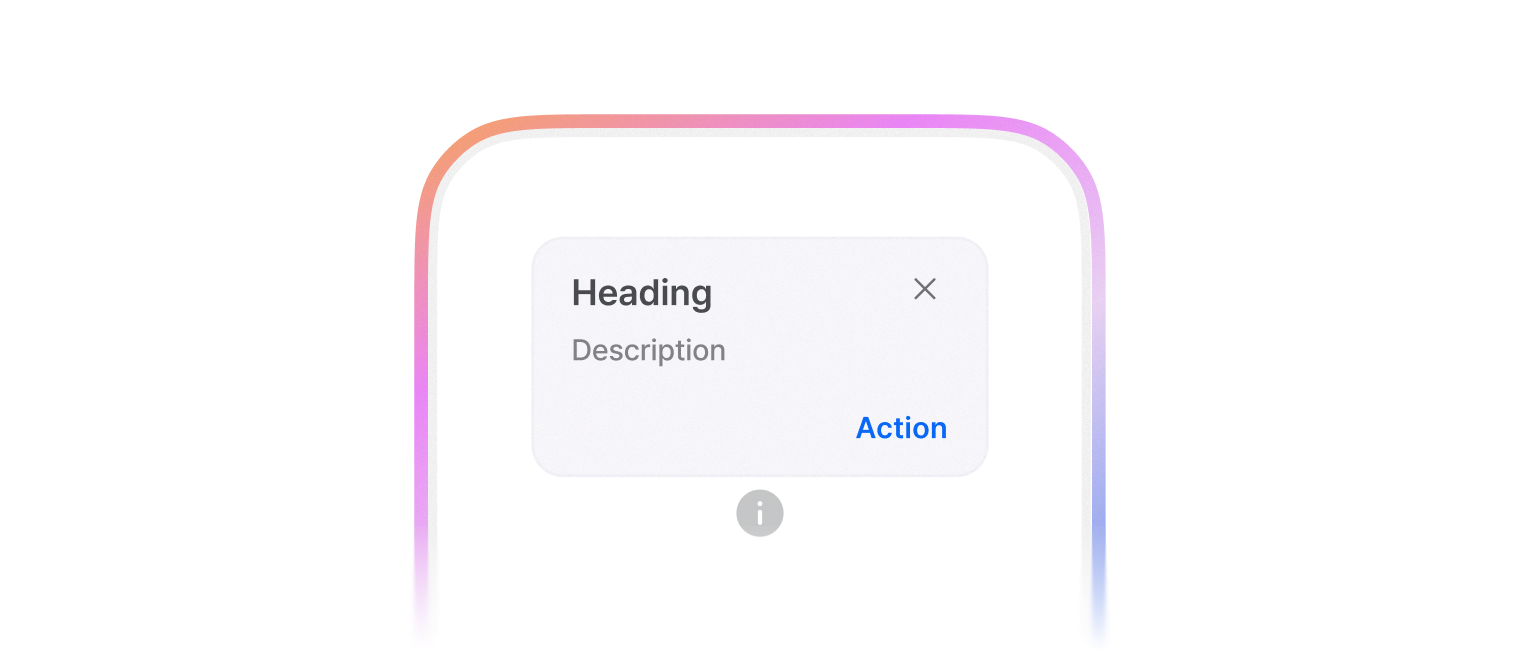
Popover
특정 UI 요소 위에서 해당 요소에 대한 추가적인 정보나 액션을 제공합니다. 단순히 정보를 보여주는 Tooltip과 달리, 내부에 버튼과 같이 사용자가 상호작용할 수 있는 콘텐츠를 포함할 수 있습니다.
extension View
func popoverNormal(isPresented: Binding<Bool>, heading: String, text: String, closeButton: Bool, action: (title: String, action: () -> Void)?, subAction: (title: String, action: () -> Void)?) -> some View
일반적인 팝오버 모디파이어를 초기화합니다.
-
Parameters
-
Return Value
일반적인 팝오버 모디파이어
func popoverCustom<V>(isPresented: Binding<Bool>, content: () -> V) -> some View
사용자 정의 팝오버 모디파이어를 초기화합니다.
-
Parameters
-
Return Value
사용자 정의 팝오버 모디파이어