Pagination

대량의 콘텐츠를 관리 가능한 크기의 페이지로 나누어 탐색할 수 있게 하는 네비게이션 요소입니다. 사용자가 콘텐츠를 효율적으로 탐색하고, 특정 페이지로 직접 이동하며, 현재 위치를 파악할 수 있도록 돕습니다.

Variants

2가지 variant를 제공합니다.

  • extended (default)
  • compact
  • minimize

Extended

  • ...
import { Pagination, PaginationSelect, PaginationField } from '@wanteddev/wds';

const Demo = () => {
  return (
    <Pagination
      leadingContent={<PaginationSelect />}
      trailingContent={<PaginationField />}
      variant="extended"
      totalPages={10}
      sx={{ width: '100%' }}
    />
  )
}

export default Demo;

Compact

  • ...
import { Pagination } from '@wanteddev/wds';

const Demo = () => {
  return (
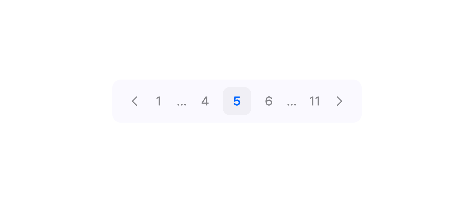
    <Pagination variant="compact" totalPages={10} />
  )
}

export default Demo;

Minimize

1/10
import { Pagination } from '@wanteddev/wds';

const Demo = () => {
  return (
    <Pagination variant="minimize" totalPages={10} />
  )
}

export default Demo;

Boundary, Sibling

boundaryPages, siblingPages로 표시할 페이지 수를 조정할 수 있습니다.

  • ...
  • ...
  • ...
  • ...
  • ...
  • ...
import { Pagination, FlexBox } from '@wanteddev/wds';

const Demo = () => {
  return (
    <FlexBox flexDirection="column" gap="24px">
      <Pagination totalPages={99} defaultPage={9} />
      <Pagination totalPages={99} defaultPage={9} boundaryPages={3} />
      <Pagination totalPages={99} defaultPage={9} siblingPages={3} />
    </FlexBox>
  )
}

export default Demo;

With contents

variant가 extended 일 때 leadingContent, trailingContent prop을 사용하여 콘텐츠를 추가할 수 있습니다.

  • ...
  • ...
커스텀 요소
  • ...
  • ...
  • ...
  • ...
커스텀 요소
  • ...
import { Pagination, PaginationField, PaginationSelect, FlexBox } from '@wanteddev/wds';

const Demo = () => {
  return (
    <FlexBox flexDirection="column" gap="40px" sx={{ width: '100%' }}>
      <FlexBox flexDirection="column" gap="24px">
        <Pagination 
          totalPages={10}
          leadingContent={<PaginationSelect />}
        />
        <Pagination 
          totalPages={10}
          leadingContent={<PaginationField />}
        />
        <Pagination 
          totalPages={10}
          leadingContent={<span>커스텀 요소</span>}
        />
      </FlexBox>

      <FlexBox flexDirection="column" gap="24px" flex="1">
        <Pagination 
          totalPages={10}
          trailingContent={<PaginationSelect />} 
        />
        <Pagination 
          totalPages={10}
          trailingContent={<PaginationField />} 
        />
        <Pagination 
          totalPages={10}
          trailingContent={<span>커스텀 요소</span>} 
        />
      </FlexBox>

      <FlexBox flexDirection="column" gap="24px" flex="1">
        <Pagination 
          totalPages={10}
          leadingContent={<PaginationSelect />}
          trailingContent={<PaginationField />} 
        />
      </FlexBox>
    </FlexBox>
  )
}

export default Demo;

API

Pagination

NameTypesdefaultValue
variant
"compact" | "extended" | "minimize"
"extended"
defaultPage
number
1
page
number
-
totalPages
number
1
boundaryPages
number
1
siblingPages
number
1
disabled
boolean
false
leadingContent
ReactNode
-
trailingContent
ReactNode
-
hidePrevButton
boolean
-
hideNextButton
boolean
-
onChange
(page: number) => void
-
children
ReactNode
-
sx
SxProp
-
xl
Merge<Omit<FlexBoxDefaultProps, "children" | "sx">, { sx?: CSSInterpolation; }> | undefined
-
lg
Merge<Omit<FlexBoxDefaultProps, "children" | "sx">, { sx?: CSSInterpolation; }> | undefined
-
md
Merge<Omit<FlexBoxDefaultProps, "children" | "sx">, { sx?: CSSInterpolation; }> | undefined
-
sm
Merge<Omit<FlexBoxDefaultProps, "children" | "sx">, { sx?: CSSInterpolation; }> | undefined
-
xs
Merge<Omit<FlexBoxDefaultProps, "children" | "sx">, { sx?: CSSInterpolation; }> | undefined
-
flexDirection
Property.FlexDirection | undefined
-
flexWrap
Property.FlexWrap | undefined
-
justifyContent
Property.JustifyContent | undefined
-
alignItems
Property.AlignItems | undefined
-
alignContent
Property.AlignContent | undefined
-
order
Property.Order | undefined
-
flex
Property.Flex<string | number> | undefined
-
flexGrow
Property.FlexGrow | undefined
-
flexShrink
Property.FlexShrink | undefined
-
flexBasis
Property.FlexBasis<string | number> | undefined
-
alignSelf
Property.AlignSelf | undefined
-
gap
Property.Gap<string | number> | undefined
-
rowGap
Property.RowGap<string | number> | undefined
-
columnGap
Property.ColumnGap<string | number> | undefined
-

PaginationSelect

NameTypesdefaultValue
defaultPageSize
number
pageSizeOptions[0] ?? 10
pageSize
number
-
pageSizeOptions
number[]
[10, 20, 30, 40, 50]
label
string
"씩 보기"
disabled
boolean
-
optionRender
(pageSize: number) => ReactNode
-
onChange
(pageSize: number) => void
-
open
boolean
-
onOpenChange
(open: boolean) => void
-
defaultOpen
boolean
-
contentProps
ComponentPropsWithoutRef<typeof MenuContent>
-
sx
SxProp
-
children
ReactNode
-
xl
Merge<Omit<FlexBoxDefaultProps, "children" | "sx">, { sx?: CSSInterpolation; }> | undefined
-
lg
Merge<Omit<FlexBoxDefaultProps, "children" | "sx">, { sx?: CSSInterpolation; }> | undefined
-
md
Merge<Omit<FlexBoxDefaultProps, "children" | "sx">, { sx?: CSSInterpolation; }> | undefined
-
sm
Merge<Omit<FlexBoxDefaultProps, "children" | "sx">, { sx?: CSSInterpolation; }> | undefined
-
xs
Merge<Omit<FlexBoxDefaultProps, "children" | "sx">, { sx?: CSSInterpolation; }> | undefined
-
flexDirection
Property.FlexDirection | undefined
-
flexWrap
Property.FlexWrap | undefined
-
justifyContent
Property.JustifyContent | undefined
-
alignItems
Property.AlignItems | undefined
-
alignContent
Property.AlignContent | undefined
-
order
Property.Order | undefined
-
flex
Property.Flex<string | number> | undefined
-
flexGrow
Property.FlexGrow | undefined
-
flexShrink
Property.FlexShrink | undefined
-
flexBasis
Property.FlexBasis<string | number> | undefined
-
alignSelf
Property.AlignSelf | undefined
-
gap
Property.Gap<string | number> | undefined
-
rowGap
Property.RowGap<string | number> | undefined
-
columnGap
Property.ColumnGap<string | number> | undefined
-

PaginationField

NameTypesdefaultValue
label
string
"페이지 이동"
disabled
boolean
-
sx
SxProp
-
children
ReactNode
-
onReset
(prevValue: string) => void
-
xl
Merge<Pick<TextFieldDefaultProps, "height" | "width">, { sx?: CSSInterpolation; }> | undefined
-
lg
Merge<Pick<TextFieldDefaultProps, "height" | "width">, { sx?: CSSInterpolation; }> | undefined
-
md
Merge<Pick<TextFieldDefaultProps, "height" | "width">, { sx?: CSSInterpolation; }> | undefined
-
sm
Merge<Pick<TextFieldDefaultProps, "height" | "width">, { sx?: CSSInterpolation; }> | undefined
-
xs
Merge<Pick<TextFieldDefaultProps, "height" | "width">, { sx?: CSSInterpolation; }> | undefined
-
leadingContent
ReactNode
-
trailingContent
ReactNode
-
positive
boolean
-
height
Property.Height<string | number> | undefined
-
width
Property.Width<string | number> | undefined
-
invalid
boolean
-
trailingButton
ReactNode
-
wrapperRef
null | RefObject | (instance: null | HTMLDivElement) => void | () => VoidOrUndefinedOnly
-

© 2026 Wanted Lab, Inc.