Bottom navigation
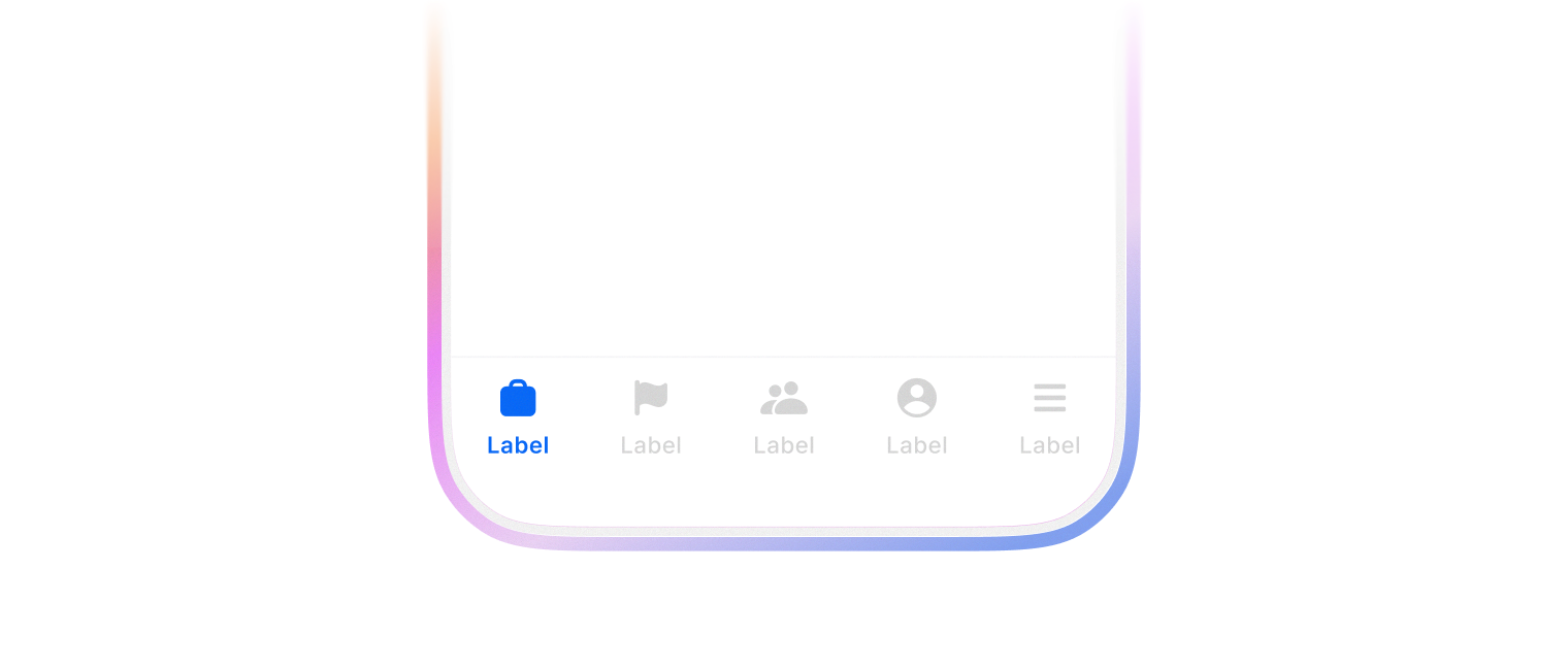
모바일 앱의 하단에 고정되어 주요 섹션 간 빠른 전환을 제공하는 네비게이션 요소입니다. 엄지로 쉽게 접근할 수 있는 위치에 3-5개의 핵심 기능을 배치하여 앱의 주요 영역으로 한 번에 이동할 수 있게 합니다.
document.body 의 스크롤이 최하단으로 이동할 때 border-color, background-color, backdrop-filter 가 사라집니다.
icon prop 으로 아이콘을 추가하여 사용합니다.
import {
  BottomNavigation,
  BottomNavigationItem,
} from '@wanteddev/wds';
import {
  IconNavigationRecruit,
  IconNavigationCareer,
  IconNavigationSocial,
  IconNavigationMypage,
  IconNavigationMenu,
} from '@wanteddev/wds-icon';

const Demo = () => {
  return (
    <BottomNavigation defaultValue="recruit" sx={{ width: '75%' }}>
      <BottomNavigationItem value="recruit" label="채용" icon={<IconNavigationRecruit />} />
      <BottomNavigationItem value="career" label="커리어" icon={<IconNavigationCareer />} />
      <BottomNavigationItem value="social" label="소셜" icon={<IconNavigationSocial />} />
      <BottomNavigationItem value="mywanted" label="MY 원티드" icon={<IconNavigationMypage />} />
      <BottomNavigationItem value="menu" label="전체" icon={<IconNavigationMenu />} />
    </BottomNavigation>
  )
}

export default Demo;BottomNavigation 은 여러 컴포넌트를 조합해서 사용합니다.
기본 구성은 아래와 같습니다.
Icon 영역에 Avatar 컴포넌트를 사용할 수 있습니다.
import {
  BottomNavigation,
  BottomNavigationItem,
  Avatar,
} from '@wanteddev/wds';
import {
  IconNavigationRecruit,
  IconNavigationCareer,
  IconNavigationSocial,
  IconNavigationMypage,
  IconNavigationMenu,
} from '@wanteddev/wds-icon';

const Demo = () => {
  return (
    <BottomNavigation defaultValue="recruit" sx={{ width: '75%' }}>
      <BottomNavigationItem value="recruit" label="채용" icon={<IconNavigationRecruit />} />
      <BottomNavigationItem value="career" label="커리어" icon={<IconNavigationCareer />} />
      <BottomNavigationItem value="social" label="소셜" icon={<IconNavigationSocial />} />
      <BottomNavigationItem
        value="mywanted"
        label="MY 원티드"
        icon={<Avatar size="xsmall" />}
      />
      <BottomNavigationItem value="menu" label="전체" icon={<IconNavigationMenu />} />
    </BottomNavigation>
  )
}

export default Demo;