Section message
특정 섹션이나 페이지에 대해 사용자의 주의가 필요한 상황을 전달하는 요소입니다. 정보, 성공, 경고, 오류 등 상황에 맞는 시각적 단서를 제공하여 사용자가 메시지의 중요도를 직관적으로 인지하도록 돕습니다.
사용자의 작업 또는 시스템 상황에 대한 상태를 제공합니다.
가독성을 위해 메시지가 2줄 이상 넘지 않도록 작성합니다.
import { SectionMessage } from '@wanteddev/wds';

const Demo = () => {
  return (
    <SectionMessage>
      Basic section message
    </SectionMessage>
  )
}

export default Demo;SectionMessage는 5가지 variant를 제공합니다.
- info
- positive
- cautionary
- negative
- custom
import { SectionMessage } from '@wanteddev/wds';

const Demo = () => {
  return (
    <SectionMessage variant="info">
      Info section message
    </SectionMessage>
  )
}

export default Demo;import { SectionMessage } from '@wanteddev/wds';
const Demo = () => {
return (
<SectionMessage variant="positive">
Positive section message
</SectionMessage>
)
}
export default Demo;import { SectionMessage } from '@wanteddev/wds';
const Demo = () => {
return (
<SectionMessage variant="cautionary">
Cautionary section message
</SectionMessage>
)
}
export default Demo;import { SectionMessage } from '@wanteddev/wds';
const Demo = () => {
return (
<SectionMessage variant="negative">
Negative section message
</SectionMessage>
)
}
export default Demo;Custom variant는 좌측에 아이콘을 추가할 수 있습니다.
import { SectionMessage } from '@wanteddev/wds';
import { IconBlank } from '@wanteddev/wds-icon';

const Demo = () => {
  return (
    <SectionMessage
      variant="custom"
      leadingContent={<IconBlank />}
    >
      Custom section message
    </SectionMessage>
  )
}

export default Demo;추가 설명을 작성할 수 있습니다.
import { SectionMessage } from '@wanteddev/wds';

const Demo = () => {
  return (
    <SectionMessage variant="info" description="Description">
      Section message
    </SectionMessage>
  )
}

export default Demo;closeButton 옵션을 통해 닫기 버튼을 표시할 수 있습니다.
import { SectionMessage } from '@wanteddev/wds';

const Demo = () => {
  return (
    <SectionMessage variant="info" closeButton>
      Section message
    </SectionMessage>
  )
}

export default Demo;trailingButton, bottomButton 옵션을 통해 버튼을 추가할 수 있습니다.
우측에 오는 버튼을 추가할 수 있습니다.
import { SectionMessage, FlexBox, TextButton } from '@wanteddev/wds';
import { IconBlank } from '@wanteddev/wds-icon';

const Demo = () => {
  return (
    <FlexBox flexDirection="column" gap="16px" sx={{ width: '100%' }}>
      <SectionMessage
        variant="info"
        closeButton
        description="Description"
        trailingButton={(
          <TextButton size="small">Button</TextButton>
        )}>
        Section message
      </SectionMessage>
      <SectionMessage
        variant="info"
        description="Description"
        trailingButton={(
          <TextButton size="small">Button</TextButton>
        )}>
        Section message
      </SectionMessage>
    </FlexBox>
  )
}
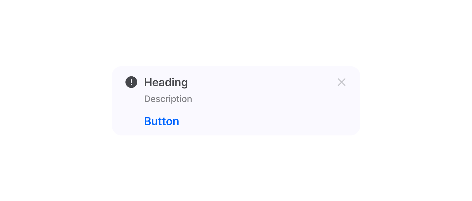
export default Demo;하단 영역에 버튼을 추가할 수 있습니다.
import { SectionMessage, FlexBox, Button } from '@wanteddev/wds';
import { IconBlank } from '@wanteddev/wds-icon';

const Demo = () => {
  return (
    <SectionMessage
      variant="info"
      description="Description"
      closeButton
      bottomButton={(
        <Button size="small">
          Button
        </Button>
      )}>
      Section message
    </SectionMessage>
  )
}

export default Demo;WAI-ARIA Alert Pattern 을 준수합니다.