Push badge
새로운 업데이트나 알림이 있음을 시각적으로 알려주기 위해 사용합니다.
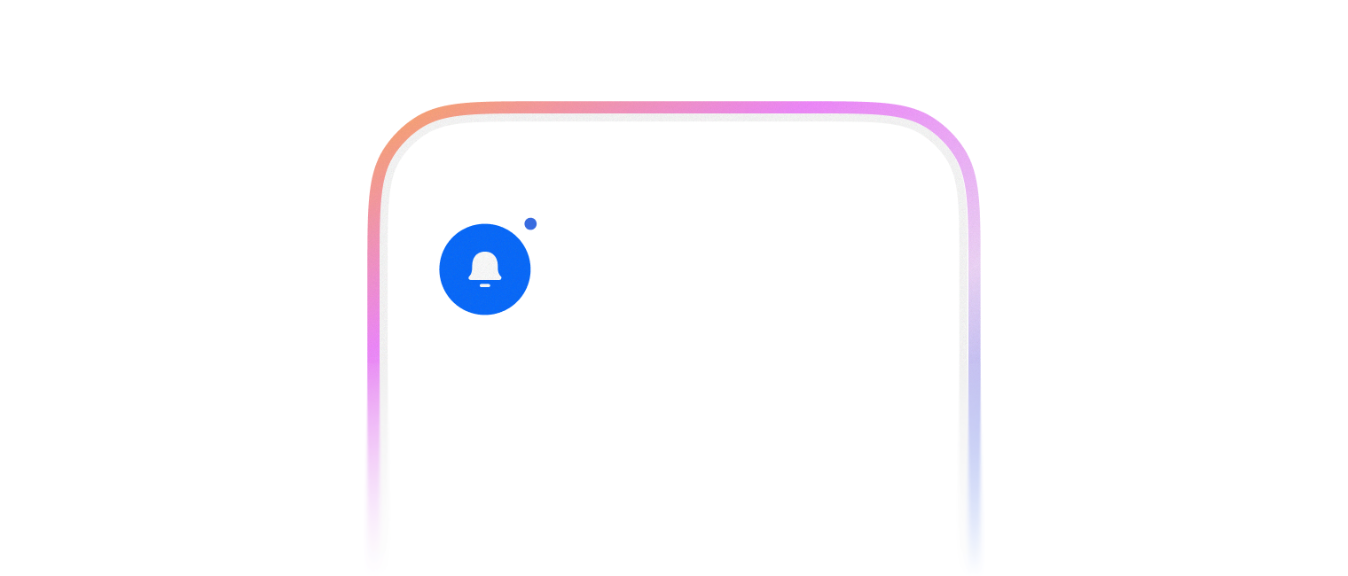
PushBadge는 3가지 variant를 제공합니다.
- dot
- new
- number

import { Avatar, PushBadge, FlexBox, IconButton, Switch } from '@wanteddev/wds';
import { IconBell } from '@wanteddev/wds-icon';
import { useState } from 'react';

const Demo = () => {
  const [invisible, setInvisible] = useState(false);

  return (
    <FlexBox flexDirection="column" gap="8px">
      <Switch checked={!invisible} onCheckedChange={(value) => setInvisible(!value)} size="small" />

      <FlexBox gap="16px" alignItems="center">
        <IconButton size={24}>
          <PushBadge invisible={invisible}>
            <IconBell />
          </PushBadge>
        </IconButton>

        <PushBadge invisible={invisible}>
          <Avatar
            src="https://static.wanted.co.kr/oneid-user/2kcR2ULXRgEC7Rgk5psLTK/BwWtS7ZW8ryS2dpQrAW8Cr.png"
            alt="User"
          />
        </PushBadge>
      </FlexBox>
    </FlexBox>
  )
}

export default Demo;import { Avatar, PushBadge, FlexBox, IconButton, Switch } from '@wanteddev/wds';
import { IconBell } from '@wanteddev/wds-icon';
import { useState } from 'react';
const Demo = () => {
const [invisible, setInvisible] = useState(false);
return (
<FlexBox flexDirection="column" gap="8px">
<Switch checked={!invisible} onCheckedChange={(value) => setInvisible(!value)} size="small" />
<FlexBox gap="16px" alignItems="center">
<IconButton size={24}>
<PushBadge variant="new" invisible={invisible}>
<IconBell />
</PushBadge>
</IconButton>
<PushBadge variant="new" invisible={invisible}>
<Avatar
src="https://static.wanted.co.kr/oneid-user/2kcR2ULXRgEC7Rgk5psLTK/BwWtS7ZW8ryS2dpQrAW8Cr.png"
alt="User"
/>
</PushBadge>
</FlexBox>
</FlexBox>
)
}
export default Demo;count 옵션을 주어 숫자를 표시할 수 있어요.
import { Avatar, PushBadge, FlexBox, IconButton, Switch } from '@wanteddev/wds';
import { IconBell } from '@wanteddev/wds-icon';
import { useState } from 'react';

const Demo = () => {
  const [invisible, setInvisible] = useState(false);

  return (
    <FlexBox flexDirection="column" gap="8px">
      <Switch checked={!invisible} onCheckedChange={(value) => setInvisible(!value)} size="small" />

      <FlexBox gap="16px" alignItems="center">
        <IconButton size={24}>
          <PushBadge variant="number" count={3} invisible={invisible}>
            <IconBell />
          </PushBadge>
        </IconButton>

        <PushBadge variant="number" count={3} invisible={invisible}>
          <Avatar
            src="https://static.wanted.co.kr/oneid-user/2kcR2ULXRgEC7Rgk5psLTK/BwWtS7ZW8ryS2dpQrAW8Cr.png"
            alt="User"
          />
        </PushBadge>
      </FlexBox>
    </FlexBox>
  )
}

export default Demo;position옵션으로 뱃지의 위치를 조정할 수 있습니다.offsetX,offsetY를 이용하여 추가적인 위치를 조정할 수 있습니다.
import { TextButton, PushBadge, FlexBox, Box } from '@wanteddev/wds';

const ExampleBox = () => {
return (
  <Box
    sx={(theme) => ({
      boxShadow: `inset 0 0 0 1px ${theme.semantic.line.solid.normal}`,
      width: 60,
      height: 60,
    })}
  />
)
}

const Demo = () => {
return (
  <FlexBox flexDirection="column" gap="8px">
    <FlexBox gap="16px" alignItems="center">
      <PushBadge position="top-left">
        <ExampleBox />
      </PushBadge>
      <PushBadge position="top-center">
        <ExampleBox />
      </PushBadge>
      <PushBadge position="top-right">
        <ExampleBox />
      </PushBadge>
    </FlexBox>

    <FlexBox gap="16px" alignItems="center">
      <PushBadge position="middle-left">
        <ExampleBox />
      </PushBadge>
      <PushBadge position="middle-center">
        <ExampleBox />
      </PushBadge>
      <PushBadge position="middle-right">
        <ExampleBox />
      </PushBadge>
    </FlexBox>

    <FlexBox gap="16px" alignItems="center">
      <PushBadge position="bottom-left">
        <ExampleBox />
      </PushBadge>
      <PushBadge position="bottom-center">
        <ExampleBox />
      </PushBadge>
      <PushBadge position="bottom-right">
        <ExampleBox />
      </PushBadge>
    </FlexBox>
  </FlexBox>
)
}

export default Demo;3가지 사이즈를 제공합니다.
- xsmall (default)
- small
- medium
import { PushBadge, FlexBox, Box } from '@wanteddev/wds';

const ExampleBox = () => {
return (
  <Box
    sx={(theme) => ({
      boxShadow: `inset 0 0 0 1px ${theme.semantic.line.solid.normal}`,
      width: 60,
      height: 60,
    })}
  />
)
}

const Demo = () => {
return (
  <FlexBox gap="12px" flexDirection="column" alignItems="center">
    <PushBadge size="xsmall">
      <ExampleBox />
    </PushBadge>
    <PushBadge size="small">
      <ExampleBox />
    </PushBadge>
    <PushBadge size="medium">
      <ExampleBox />
    </PushBadge>
  </FlexBox>
)
}

export default Demo;