Alert
현재 화면 위에 창을 띄워, 사용자의 흐름을 잠시 멈추고 주의할 내용을 안내하는 컴포넌트입니다. 사용자가 반드시 확인하고 넘어가야 하는 주요한 상황에 사용합니다.
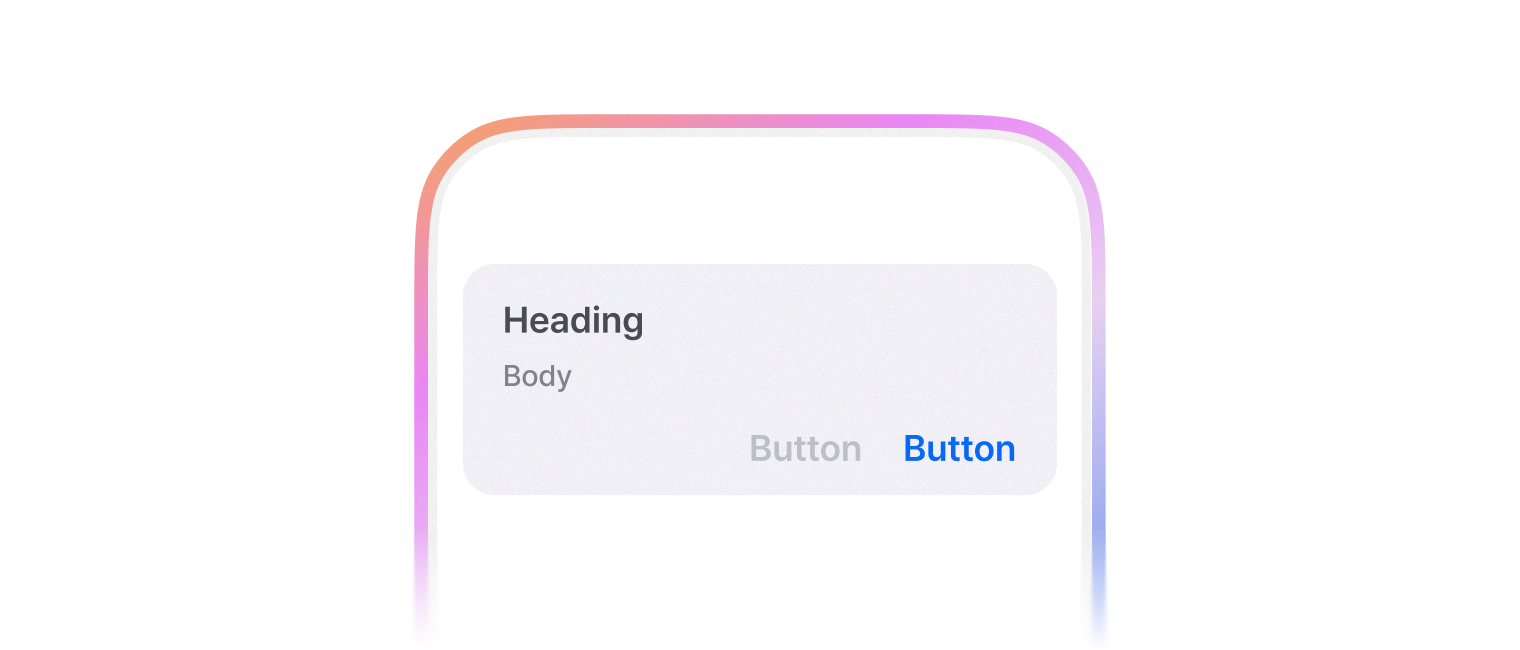
유저에게 중요한 액션을 실행할지 다시 한 번 묻고 싶을 때 사용합니다.
useAlert hook을 사용하면 Promise 형태로 사용할 수 있습니다.
import { FlexBox, Button, Typography, Alert, AlertContainer, AlertContent, AlertHeading, AlertDescription, AlertActionArea, AlertActionAreaButton, AlertTrigger } from '@wanteddev/wds';
import { useState } from 'react';

const Demo = () => {
  const [open, setOpen] = useState(false);
  const [result, setResult] = useState<string | null>(null);

  const handleOpen = () => {
    setOpen(true);
  }

  return (
    <FlexBox flexDirection="column" gap="16px">
      <Typography align="center">{result}</Typography>

      <Alert open={open} onOpenChange={setOpen}>
        <AlertTrigger>
          <Button onClick={handleOpen}>Open</Button>
        </AlertTrigger>

        <AlertContainer onDismiss={() => setResult('Dismissed')}>
          <AlertContent>
            <AlertHeading>Heading</AlertHeading>
            <AlertDescription>Description</AlertDescription>
          </AlertContent>
          <AlertActionArea>
            <AlertActionAreaButton variant="assistive" onClick={() => setResult('Cancel')}>
              Cancel
            </AlertActionAreaButton>
            <AlertActionAreaButton variant="normal" onClick={() => setResult('Confirm')}>
              Confirm
            </AlertActionAreaButton>
          </AlertActionArea>
        </AlertContainer>
      </Alert>
    </FlexBox>
  )
}

export default Demo;Alert 은 여러 컴포넌트를 조합해서 사용합니다.
AlertTrigger 는 선택적으로 사용할 수 있습니다.
기본 구성은 아래와 같습니다.
variant 옵션에 따라 버튼의 색상이 달라집니다.
- normal
- assistive
- negative
import { FlexBox, Button, Alert, AlertContainer, AlertContent, AlertHeading, AlertDescription, AlertActionArea, AlertActionAreaButton, AlertTrigger } from '@wanteddev/wds';
import { useState } from 'react';

const Demo = () => {
  const [open, setOpen] = useState(false);

  const handleOpen = () => {
    setOpen(true);
  }

  return (
    <FlexBox flexDirection="column" gap="16px">
      <Alert open={open} onOpenChange={setOpen}>
        <AlertTrigger>
          <Button onClick={handleOpen}>Open</Button>
        </AlertTrigger>

        <AlertContainer>
          <AlertContent>
            <AlertHeading>Heading</AlertHeading>
            <AlertDescription>Description</AlertDescription>
          </AlertContent>
          <AlertActionArea>
            <AlertActionAreaButton variant="assistive">
              Assistive
            </AlertActionAreaButton>
            <AlertActionAreaButton variant="normal">
              Normal
            </AlertActionAreaButton>
            <AlertActionAreaButton variant="negative">
              Negative
            </AlertActionAreaButton>
          </AlertActionArea>
        </AlertContainer>
      </Alert>
    </FlexBox>
  )
}

export default Demo;AlertActionAreaButton 은 기본적으로 클릭 시 Alert을 닫습니다.
이를 방지하고 싶다면 onClick 에 e.preventDefault 를 추가해주세요.
import { FlexBox, Button, Alert, AlertContainer, AlertContent, AlertHeading, AlertDescription, AlertActionArea, AlertActionAreaButton, AlertTrigger } from '@wanteddev/wds';
import { useState } from 'react';

const Demo = () => {
  const [open, setOpen] = useState(false);

  const handleOpen = () => {
    setOpen(true);
  }

  return (
    <FlexBox flexDirection="column" gap="16px">
      <Alert open={open} onOpenChange={setOpen}>
        <AlertTrigger>
          <Button onClick={handleOpen}>Open</Button>
        </AlertTrigger>

        <AlertContainer>
          <AlertContent>
            <AlertHeading>Heading</AlertHeading>
            <AlertDescription>Description</AlertDescription>
          </AlertContent>
          <AlertActionArea>
            <AlertActionAreaButton variant="assistive" onClick={e => e.preventDefault()}>
              Prevent
            </AlertActionAreaButton>
            <AlertActionAreaButton variant="normal">
              No Prevent
            </AlertActionAreaButton>
          </AlertActionArea>
        </AlertContainer>
      </Alert>
    </FlexBox>
  )
}

export default Demo;FlexBox 와 동일한 Props를 사용합니다.
Typography 와 동일한 Props를 사용합니다.
Typography 와 동일한 Props를 사용합니다.
FlexBox 과 동일한 Props를 사용합니다.