List cell
콘텐츠를 하나의 리스트 단위로 표현하는 요소로, 이미지, 텍스트, 인터랙션 요소 등을 유연하게 조합하여 구성할 수 있습니다. 일관되고 정돈된 형태로 정보를 탐색할 수 있도록 돕습니다.
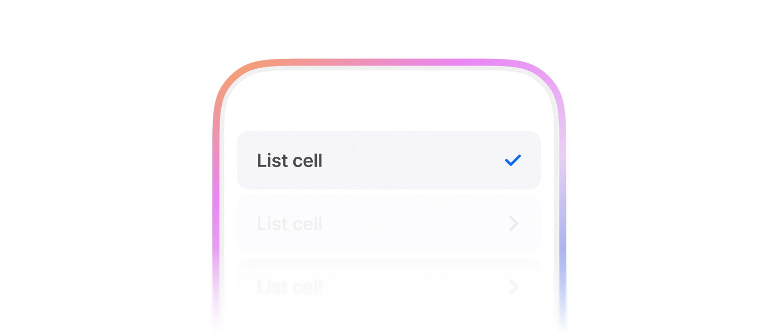
인터랙션이 가능한 리스트 셀입니다.
leadingContent, trailingContent에 요소를 추가할 때는 ListCellContent로 감싸서 사용합니다.
ListCell 클릭 시 자동으로 leadingContent, trailingContent 내부의 컨트롤 요소를 클릭 처리합니다.
단,
Switch컴포넌트는 클릭 처리하지 않습니다.
import { List, ListCell, ListCellContent, Checkbox } from '@wanteddev/wds';

const Demo = () => {
  return (
    <List sx={{ width: '100%' }}>
      <ListCell leadingContent={(
        <ListCellContent variant="checkbox">
          <Checkbox tabIndex={-1} />
        </ListCellContent>
      )}>
        텍스트
      </ListCell>
      <ListCell textProps={{ caption: 'Caption' }} leadingContent={(
        <ListCellContent variant="checkbox">
          <Checkbox tabIndex={-1} />
        </ListCellContent>
      )}>
        텍스트
      </ListCell>
    </List>
  )
}

export default Demo;보통 List 컴포넌트와 함께 사용합니다.
selected, disabled, disableInteraction으로 상태를 표시할 수 있습니다.
현재 선택된 셀을 표시합니다.
import { List, ListCell } from '@wanteddev/wds';

const Demo = () => {
  return (
    <List sx={{ width: '100%' }}>
      <ListCell selected>
        Selected list cell
      </ListCell>
    </List>
  )
}

export default Demo;disabled 상태의 셀을 표시할 수 있으며 클릭 이벤트는 비활성화됩니다.
import { List, ListCell } from '@wanteddev/wds';

const Demo = () => {
  return (
    <List sx={{ width: '100%' }}>
      <ListCell disabled>
        Disabled list cell
      </ListCell>
    </List>
  )
}

export default Demo;Cell을 화면 가득 채워야할 때 fillWidth 속성을 사용하여 UI를 표시합니다.
import { List, ListCell } from '@wanteddev/wds';

const Demo = () => {
  return (
    <List sx={{ width: '100%' }}>
      <ListCell fillWidth>
        Fill width list cell
      </ListCell>
    </List>
  )
}

export default Demo;기본 수직 정렬은 flex-start입니다. alignItems로 수직 정렬을 조정할 수 있습니다.
import { List, ListCell, ListCellContent, Switch } from '@wanteddev/wds';

const Demo = () => {
  return (
    <List sx={{ width: '100%' }}>
      <ListCell
        trailingContent={(
          <ListCellContent variant="switch">
            <Switch />
          </ListCellContent>
        )}
      >
        텍스트, Top 정렬
      </ListCell>

      <ListCell
        alignItems="center"
        trailingContent={(
          <ListCellContent variant="switch">
            <Switch />
          </ListCellContent>
        )}
      >
        텍스트, Center 정렬
      </ListCell>
    </List>
  )
}

export default Demo;divider 속성을 사용하여 셀 사이에 구분선을 추가할 수 있습니다.
import { List, ListCell } from '@wanteddev/wds';

const Demo = () => {
  return (
    <List sx={{ width: '100%' }}>
      <ListCell divider>
        Divider list cell
      </ListCell>
      <ListCell>
        Divider list cell
      </ListCell>
    </List>
  )
}

export default Demo;verticalPadding 속성을 사용하여 수직 간격을 조정할 수 있습니다.
- none
- small
- medium (default)
- large
verticalPadding="none" 일 때에는 인터렉션 영역이 비활성화됩니다.
import { List, ListCell } from '@wanteddev/wds';

const Demo = () => {
  return (
    <List sx={{ width: '100%' }}>
      <ListCell verticalPadding="none">
        VerticalPadding, None
      </ListCell>
      <ListCell>
        VerticalPadding, Medium (default)
      </ListCell>
      <ListCell verticalPadding="small">
        VerticalPadding, Small
      </ListCell>
      <ListCell verticalPadding="large">
        VerticalPadding, Large
      </ListCell>
    </List>
  )
}

export default Demo;leadingContent, trailingContent를 사용해서 콘텐츠를 추가할 수 있습니다.
콘텐츠를 추가할 때는 ListCellContent로 래핑해서 사용합니다.
Cell을 클릭했을 때 콘텐츠 영역이 클릭되지 않게 하려면 e.stopPropagation 을 사용해서 방지할 수 있습니다.

import { Checkbox, Thumbnail, Avatar, List, ListCell, ListCellContent, IconButton, CheckMark, TextButton, ContentBadge, Switch } from '@wanteddev/wds';
import { IconBlank } from '@wanteddev/wds-icon';

const Demo = () => {
  return (
    <List gap="16px" sx={{ width: '100%' }}>
      <ListCell
        trailingContent={
          <ListCellContent variant="icon">
            <IconBlank />
          </ListCellContent>
        }
      >
        텍스트, Normal
      </ListCell>
      <ListCell
        trailingContent={
          <ListCellContent variant="checkbox">
            <CheckMark tabIndex={-1} />
          </ListCellContent>
        }
      >
        텍스트, Normal
      </ListCell>
      <ListCell
        trailingContent={
          <ListCellContent variant="button">
            <TextButton size="small" color="assistive" tabIndex={-1}>
              Button
            </TextButton>
          </ListCellContent>
        }
      >
        텍스트, Normal
      </ListCell>
      <ListCell
        trailingContent={
          <ListCellContent>
            <ContentBadge color="neutral">Badge</ContentBadge>
          </ListCellContent>
        }
      >
        텍스트, Normal
      </ListCell>
      <ListCell
        trailingContent={
          <ListCellContent variant="chevron">
            값
          </ListCellContent>
        }
      >
        텍스트, Normal
      </ListCell>
      <ListCell
        trailingContent={
          <ListCellContent variant="value">
            값
          </ListCellContent>
        }
      >
        텍스트, Normal
      </ListCell>
      <ListCell
        leadingContent={
          <ListCellContent variant="icon">
            <IconBlank />
          </ListCellContent>
        }
        trailingContent={
          <ListCellContent variant="chevron" chevron={false}>
            값
          </ListCellContent>
        }
      >
        텍스트, Normal
      </ListCell>
      <ListCell
        leadingContent={
          <ListCellContent variant="checkbox">
            <Checkbox tabIndex={-1} />
          </ListCellContent>
        }
        trailingContent={
          <ListCellContent variant="chevron" chevron={false}>
            값
          </ListCellContent>
        }
      >
        텍스트, Normal
      </ListCell>
      <ListCell
        alignItems="center"
        leadingContent={
          <ListCellContent variant="avatar">
            <Avatar variant="person" size="medium" />
          </ListCellContent>
        }
        trailingContent={
          <ListCellContent variant="chevron" chevron={false}>
            값
          </ListCellContent>
        }
      >
        텍스트, Medium
      </ListCell>
      <ListCell
        alignItems="center"
        leadingContent={
          <ListCellContent variant="thumbnail">
            <Thumbnail border radius ratio="1:1" width="56px" />
          </ListCellContent>
        }
        trailingContent={
          <ListCellContent variant="checkbox">
            <CheckMark tabIndex={-1} />
          </ListCellContent>
        }
      >
        텍스트, Medium
      </ListCell>
      <ListCell
        alignItems="center"
        disableInteraction
        trailingContent={
          <ListCellContent variant="switch">
            <Switch />
          </ListCellContent>
        }
      >
        텍스트, Medium
      </ListCell>
      <ListCell
        textProps={{ caption: 'Caption' }}
        leadingContent={
          <ListCellContent variant="large-icon">
            <IconBlank />
          </ListCellContent>
        }
        trailingContent={
          <ListCellContent variant="chevron" chevron={false}>
            값
          </ListCellContent>
        }
      >
        Content, Large
      </ListCell>
      <ListCell
        alignItems="center"
        textProps={{ caption: 'Caption' }}
        leadingContent={
          <ListCellContent variant="large-icon">
            <IconBlank />
          </ListCellContent>
        }
        trailingContent={
          <ListCellContent variant="checkbox">
            <CheckMark tabIndex={-1} />
          </ListCellContent>
        }
      >
        Content, Large
      </ListCell>
      <ListCell
        textProps={{ caption: 'Caption' }}
        leadingContent={
          <ListCellContent variant="custom">
            <Thumbnail
              src="https://static.wanted.co.kr/images/company/79/elpzxpmgh94xesrf__1080_790.png"
              alt="Wanted Company Image"
              width="56px"
              ratio="1:1"
            />
          </ListCellContent>
        }
        trailingContent={
          <ListCellContent variant="checkbox">
            <CheckMark tabIndex={-1} />
          </ListCellContent>
        }
      >
        Content, Large
      </ListCell>
    </List>
  )
}

export default Demo;Switch를 사용하는 경우 ListCell 영역을 클릭해서 토글되지 않습니다. 스위치 영역을 직접 클릭해야만 스위치가 토글됩니다.
disableInteraction과 함께 사용하면 자연스러운 동작으로 사용 가능합니다.
import { Button, FlexBox, Switch, List, ListCell, ListCellContent, FormField, FormControl, FormLabel } from '@wanteddev/wds';
import { useForm, Controller } from 'react-hook-form';

const Demo = () => {
  const form = useForm();

  return (
    <FlexBox
      as="form"
      flexDirection="column"
      gap="20px"
      onSubmit={form.handleSubmit((v) => alert(JSON.stringify(v)))}
      sx={{ width: '100%' }}
    >
      <List>
        <Controller
          control={form.control}
          name="notification"
          render={({ field, formState }) => (
            <ListCell
              as={FormField}
              disableInteraction
              trailingContent={
                <FormControl>
                  <ListCellContent variant="switch">
                    <Switch
                      {...field}
                      checked={field.value}
                      onCheckedChange={field.onChange}
                    />
                  </ListCellContent>
                </FormControl>
              }
            >
              알림 받기
            </ListCell>
          )}
        />
        <Controller
          control={form.control}
          name="darkMode"
          render={({ field, formState }) => (
            <ListCell
              as={FormField}
              disableInteraction
              trailingContent={
                <FormControl>
                  <ListCellContent variant="switch">
                    <Switch
                      {...field}
                      checked={field.value}
                      onCheckedChange={field.onChange}
                    />
                  </ListCellContent>
                </FormControl>
              }
            >
              다크 모드
            </ListCell>
          )}
        />
      </List>

      <Button type="submit">제출</Button>
    </FlexBox>
  )
}

export default Demo;ellipsis 속성을 사용하여 Content가 넘치는 경우 말줄임표로 표시할 수 있습니다.
import { List, ListCell, ListCellContent } from '@wanteddev/wds';
import { IconBlank } from '@wanteddev/wds-icon';

const TITLE = '동해물과 백두산이 마르고 닳도록 하느님이 보우하사 우리나라 만세 무궁화 삼천리 화려 강산 대한사람 대한으로 길이 보전하세.';
const CAPTION = '남산위에 저 소나무 철갑을 두른 듯 바람서리 불변함은 우리 기상일세 무궁화 삼천리 화려 강산 대한사람 대한으로 길이 보전하세.';

const Demo = () => {
  return (
    <List gap="16px" sx={{ width: '100%' }}>
      <ListCell
        textProps={{ caption: CAPTION }}
        leadingContent={
          <ListCellContent variant="large-icon">
            <IconBlank />
          </ListCellContent>
        }
        trailingContent={
          <ListCellContent variant="chevron">
            값
          </ListCellContent>
        }
      >
        {TITLE}
      </ListCell>
      <ListCell
        ellipsis
        textProps={{ caption: CAPTION }}
        leadingContent={
          <ListCellContent variant="large-icon">
            <IconBlank />
          </ListCellContent>
        }
        trailingContent={
          <ListCellContent variant="chevron">
            값
          </ListCellContent>
        }
      >
        {TITLE}
      </ListCell>
    </List>
  )
}

export default Demo;