List card

여러 콘텐츠를 목록 형태로 보여줄 때 사용하는 요소입니다. 이미지, 텍스트, 뱃지 등 다양한 요소를 조합하여 각 항목의 정보를 시각적으로 일관성 있게 전달합니다.

Basic list card

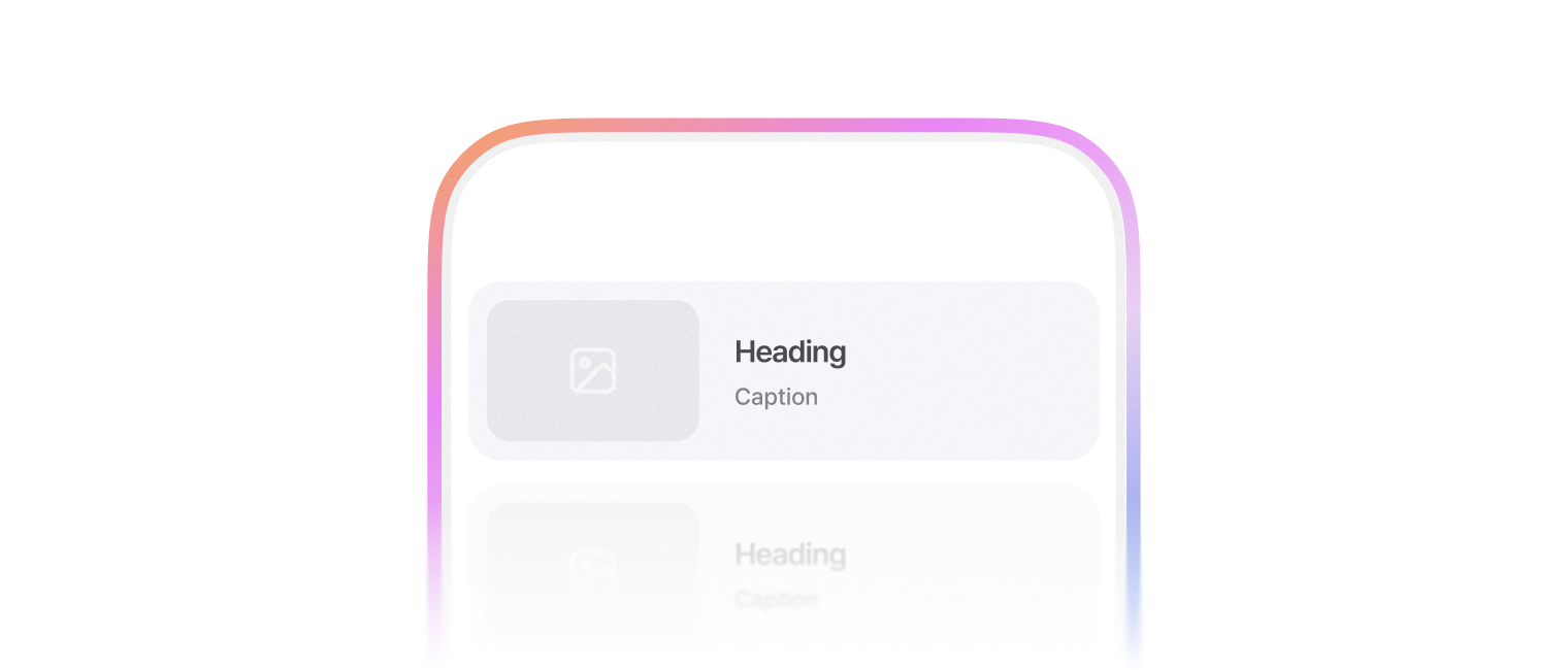
표시할 양이 많은 정보를 묶어 표시할 때 사용합니다.

Heading

Caption

Extra caption

import { CardList, CardThumbnail, CardTitle, CardCaption, CardContent } from '@wanteddev/wds';

const Demo = () => {
  return (
    <CardList
      width="45%" 
      sx={{ margin: 'auto' }}
    >
      <CardThumbnail
        src="https://static.wanted.co.kr/images/company/79/elpzxpmgh94xesrf__1080_790.png"
        alt="Wanted Company Image"
      />
      <CardContent>
        <CardTitle>Heading</CardTitle>
        <CardCaption>Caption</CardCaption>
        <CardCaption>Extra caption</CardCaption>
      </CardContent>
    </CardList>
  );
}

export default Demo;

Anatomy

아래와 같은 구조로 조합하여 사용합니다.

<CardList>
  <CardThumbnail />
  <CardContent>
    <CardContentItem position="top" />
    <CardTitle />
    <CardCaption />
    <CardCaption />
    <CardContentItem position="bottom" />
  </CardContent>
</CardList>

With contents

leadingContent, trailingContent로 좌우측 끝에 콘텐츠를 추가할 수 있습니다.

CardListContent로 요소를 감싸서 사용합니다.

Heading

Caption

import { ToggleIcon, FlexBox, Checkbox, CardList, CardTitle, CardContent, CardCaption, CardThumbnail, CardListContent } from '@wanteddev/wds';
import { IconBookmark, IconBookmarkFill } from '@wanteddev/wds-icon';
import { useState } from 'react';

const Demo = () => {
  const [checked, setChecked] = useState(false);
  const [isBookmarked, setIsBookmarked] = useState(false);

  return (
    <CardList
      sx={{ margin: 'auto' }}
      width="45%"
      leadingContent={(
        <CardListContent variant="checkbox">
          <Checkbox 
            checked={checked}
            onCheckedChange={setChecked}
          />
        </CardListContent>
      )}
      trailingContent={(
        <CardListContent variant="toggle-icon">
          <ToggleIcon 
            activeColor="semantic.primary.normal"
            active={isBookmarked}
            onActiveChange={setIsBookmarked}
          >
            {isBookmarked ? <IconBookmarkFill /> : <IconBookmark />}
          </ToggleIcon>
        </CardListContent>
      )}
    >
      <CardThumbnail
        src="https://static.wanted.co.kr/images/company/79/elpzxpmgh94xesrf__1080_790.png"
        alt="Wanted Company Image"
        width="240px"
      />
      <CardContent>
        <CardTitle>Heading</CardTitle>
        <CardCaption>Caption</CardCaption>
      </CardContent>
    </CardList>
  );
}

export default Demo;

Top/Bottom content

CardContentItemposition을 조정하여 상단, 하단에 콘텐츠를 추가할 수 있습니다.

뱃지나 부가적인 내용을 추가할 때 사용합니다.

Badge

Heading

Caption

Heading

Caption

Badge
import { FlexBox, CardList, CardTitle, CardCaption, CardContent, CardContentItem, ContentBadge, CardThumbnailSkeleton } from '@wanteddev/wds';

const Demo = () => {
  return (
    <FlexBox gap="24px" flexDirection="column" alignItems="center" sx={{ width: '100%' }}>
      <CardList width="45%">
        <CardThumbnailSkeleton animation={false} />
        <CardContent>
          <CardContentItem position="top" variant="badge">
            <ContentBadge color="neutral">Badge</ContentBadge>
          </CardContentItem>
          <CardTitle>Heading</CardTitle>
          <CardCaption>Caption</CardCaption>
        </CardContent>
      </CardList>
      <CardList width="45%">
        <CardThumbnailSkeleton animation={false} />
        <CardContent>
          <CardTitle>Heading</CardTitle>
          <CardCaption>Caption</CardCaption>
          <CardContentItem position="bottom" variant="badge">
            <ContentBadge color="neutral">Badge</ContentBadge>
          </CardContentItem>
        </CardContent>
      </CardList>
    </FlexBox>
  );
}

export default Demo;

Platform

platform 옵션을 통해 내부 콘텐츠의 간격 및 크기를 조정할 수 있습니다.

  • desktop (default)
  • mobile

Heading

platform: desktop

Extra caption

Heading

platform: mobile

Extra caption

import { FlexBox, CardList, CardThumbnail, CardTitle, CardCaption, CardContent } from '@wanteddev/wds';

const Demo = () => {
  return (
    <FlexBox gap="24px" flexDirection="column" alignItems="center" sx={{ width: '100%' }}>
      <CardList width="45%" platform="desktop">
        <CardThumbnail
          src="https://static.wanted.co.kr/images/company/79/elpzxpmgh94xesrf__1080_790.png"
          alt="Wanted Company Image"
        />
        <CardContent>
          <CardTitle>Heading</CardTitle>
          <CardCaption>platform: desktop</CardCaption>
          <CardCaption>Extra caption</CardCaption>
        </CardContent>
      </CardList>

      <CardList width="45%" platform="mobile">
        <CardThumbnail
          src="https://static.wanted.co.kr/images/company/79/elpzxpmgh94xesrf__1080_790.png"
          alt="Wanted Company Image"
        />
        <CardContent>
          <CardTitle>Heading</CardTitle>
          <CardCaption>platform: mobile</CardCaption>
          <CardCaption>Extra caption</CardCaption>
        </CardContent>
      </CardList>
    </FlexBox>
  );
}

export default Demo;

Skeleton

Card의 로딩 상태를 표현할 때 Skeleton 컴포넌트들을 조합해서 사용합니다.

  • CardListSkeleton
  • CardThumbnailSkeleton
  • CardContent
  • CardContentItemSkeleton
  • CardTitleSkeleton
  • CardCaptionSkeleton
import { CardListSkeleton, CardThumbnailSkeleton, CardContentItemSkeleton, CardTitleSkeleton, CardCaptionSkeleton, CardContent } from '@wanteddev/wds';

const Demo = () => {
  return (
    <CardListSkeleton width="45%" sx={{ marginInline: 'auto' }}>
      <CardThumbnailSkeleton />
      <CardContent>
        <CardContentItemSkeleton />
        <CardTitleSkeleton />
        <CardCaptionSkeleton type="normal" />
        <CardCaptionSkeleton type="extra" />
        <CardContentItemSkeleton />
      </CardContent>
    </CardListSkeleton>
  );
}

export default Demo;

API

CardList

정해진 breakpoint에 따라 아래 옵션을 override 할 수 있습니다.

  • platform
  • width
NameTypesdefaultValue
as
ElementType
-
platform
"desktop" | "mobile"
"desktop"
width
Property.Width<string | number> | undefined
-
children
ReactNode
-
sx
SxProp
-
xl
Merge<Omit<CardDefaultProps, "sx">, { sx?: CSSInterpolation; }> | undefined
-
lg
Merge<Omit<CardDefaultProps, "sx">, { sx?: CSSInterpolation; }> | undefined
-
md
Merge<Omit<CardDefaultProps, "sx">, { sx?: CSSInterpolation; }> | undefined
-
sm
Merge<Omit<CardDefaultProps, "sx">, { sx?: CSSInterpolation; }> | undefined
-
xs
Merge<Omit<CardDefaultProps, "sx">, { sx?: CSSInterpolation; }> | undefined
-
flexDirection
Property.FlexDirection | undefined
-
flexWrap
Property.FlexWrap | undefined
-
justifyContent
Property.JustifyContent | undefined
-
alignItems
Property.AlignItems | undefined
-
alignContent
Property.AlignContent | undefined
-
order
Property.Order | undefined
-
flex
Property.Flex<string | number> | undefined
-
flexGrow
Property.FlexGrow | undefined
-
flexShrink
Property.FlexShrink | undefined
-
flexBasis
Property.FlexBasis<string | number> | undefined
-
alignSelf
Property.AlignSelf | undefined
-
gap
Property.Gap<string | number> | undefined
-
rowGap
Property.RowGap<string | number> | undefined
-
columnGap
Property.ColumnGap<string | number> | undefined
-
leadingContent
ReactNode
-
trailingContent
ReactNode
-

CardThumbnail

NameTypesdefaultValue
xl
Merge<Pick<CardThumbnailDefaultProps, "ratio">, { sx?: CSSInterpolation; }> | undefined
-
lg
Merge<Pick<CardThumbnailDefaultProps, "ratio">, { sx?: CSSInterpolation; }> | undefined
-
md
Merge<Pick<CardThumbnailDefaultProps, "ratio">, { sx?: CSSInterpolation; }> | undefined
-
sm
Merge<Pick<CardThumbnailDefaultProps, "ratio">, { sx?: CSSInterpolation; }> | undefined
-
xs
Merge<Pick<CardThumbnailDefaultProps, "ratio">, { sx?: CSSInterpolation; }> | undefined
-
children
ReactNode
-
onLoad
() => void
-
onError
() => void
-
onAbort
() => void
-
sx
SxProp
-
leadingContent
ReactNode
-
trailingContent
ReactNode
-
src
string
-
srcSet
string
-
alt
string
-
referrerPolicy
"" | "no-referrer" | "no-referrer-when-downgrade" | "origin" | "origin-when-cross-origin" | "same-origin" | "strict-origin" | "strict-origin-when-cross-origin" | "unsafe-url"
-
crossOrigin
"" | "anonymous" | "use-credentials"
-
width
Property.Width<string | number> | undefined
-
ratio
"1:1" | "5:4" | "4:3" | "3:2" | "16:10" | "1.618:1" | "16:9" | "2:1" | "21:9"
-
portrait
boolean
-
overlay
ReactNode
-

CardThumbnailContent

NameTypesdefaultValue
variant
"text" | "custom" | "toggle-icon"
"custom"
children
ReactNode
-
sx
SxProp
-
xl
Merge<Omit<FlexBoxDefaultProps, "children" | "sx">, { sx?: CSSInterpolation; }> | undefined
-
lg
Merge<Omit<FlexBoxDefaultProps, "children" | "sx">, { sx?: CSSInterpolation; }> | undefined
-
md
Merge<Omit<FlexBoxDefaultProps, "children" | "sx">, { sx?: CSSInterpolation; }> | undefined
-
sm
Merge<Omit<FlexBoxDefaultProps, "children" | "sx">, { sx?: CSSInterpolation; }> | undefined
-
xs
Merge<Omit<FlexBoxDefaultProps, "children" | "sx">, { sx?: CSSInterpolation; }> | undefined
-
flexDirection
Property.FlexDirection | undefined
-
flexWrap
Property.FlexWrap | undefined
-
justifyContent
Property.JustifyContent | undefined
-
alignItems
Property.AlignItems | undefined
-
alignContent
Property.AlignContent | undefined
-
order
Property.Order | undefined
-
flex
Property.Flex<string | number> | undefined
-
flexGrow
Property.FlexGrow | undefined
-
flexShrink
Property.FlexShrink | undefined
-
flexBasis
Property.FlexBasis<string | number> | undefined
-
alignSelf
Property.AlignSelf | undefined
-
gap
Property.Gap<string | number> | undefined
-
rowGap
Property.RowGap<string | number> | undefined
-
columnGap
Property.ColumnGap<string | number> | undefined
-

CardContent

NameTypesdefaultValue
flexDirection
Property.FlexDirection | undefined
-
flexWrap
Property.FlexWrap | undefined
-
justifyContent
Property.JustifyContent | undefined
-
alignItems
Property.AlignItems | undefined
-
alignContent
Property.AlignContent | undefined
-
order
Property.Order | undefined
-
flex
Property.Flex<string | number> | undefined
-
flexGrow
Property.FlexGrow | undefined
-
flexShrink
Property.FlexShrink | undefined
-
flexBasis
Property.FlexBasis<string | number> | undefined
-
alignSelf
Property.AlignSelf | undefined
-
gap
Property.Gap<string | number> | undefined
-
rowGap
Property.RowGap<string | number> | undefined
-
columnGap
Property.ColumnGap<string | number> | undefined
-
children
ReactNode
-
sx
SxProp
-
xl
Merge<Omit<FlexBoxDefaultProps, "children" | "sx">, { sx?: CSSInterpolation; }> | undefined
-
lg
Merge<Omit<FlexBoxDefaultProps, "children" | "sx">, { sx?: CSSInterpolation; }> | undefined
-
md
Merge<Omit<FlexBoxDefaultProps, "children" | "sx">, { sx?: CSSInterpolation; }> | undefined
-
sm
Merge<Omit<FlexBoxDefaultProps, "children" | "sx">, { sx?: CSSInterpolation; }> | undefined
-
xs
Merge<Omit<FlexBoxDefaultProps, "children" | "sx">, { sx?: CSSInterpolation; }> | undefined
-

CardTitle

NameTypesdefaultValue
as
ElementType
-
xl
Merge<Pick<TypographyDefaultProps, "variant" | "weight" | "align">, { sx?: CSSInterpolation; }> | undefined
-
lg
Merge<Pick<TypographyDefaultProps, "variant" | "weight" | "align">, { sx?: CSSInterpolation; }> | undefined
-
md
Merge<Pick<TypographyDefaultProps, "variant" | "weight" | "align">, { sx?: CSSInterpolation; }> | undefined
-
sm
Merge<Pick<TypographyDefaultProps, "variant" | "weight" | "align">, { sx?: CSSInterpolation; }> | undefined
-
xs
Merge<Pick<TypographyDefaultProps, "variant" | "weight" | "align">, { sx?: CSSInterpolation; }> | undefined
-
color
ThemeColorsToken
-
children
ReactNode
-
sx
SxProp
-
variant
"display1" | "display2" | "display3" | "title1" | "title2" | "title3" | "heading1" | "heading2" | "headline1" | "headline2" | "body1" | "body1-reading" | "body2" | "body2-reading" | "label1" | "label1-reading" | "label2" | "caption1" | "caption2"
-
weight
"medium" | "regular" | "bold"
-
align
Property.TextAlign | undefined
-
noWrap
boolean
-
display
Property.Display | undefined
-

CardCaption

NameTypesdefaultValue
as
ElementType
-
xl
Merge<Pick<TypographyDefaultProps, "variant" | "weight" | "align">, { sx?: CSSInterpolation; }> | undefined
-
lg
Merge<Pick<TypographyDefaultProps, "variant" | "weight" | "align">, { sx?: CSSInterpolation; }> | undefined
-
md
Merge<Pick<TypographyDefaultProps, "variant" | "weight" | "align">, { sx?: CSSInterpolation; }> | undefined
-
sm
Merge<Pick<TypographyDefaultProps, "variant" | "weight" | "align">, { sx?: CSSInterpolation; }> | undefined
-
xs
Merge<Pick<TypographyDefaultProps, "variant" | "weight" | "align">, { sx?: CSSInterpolation; }> | undefined
-
color
ThemeColorsToken
"semantic.label.alternative"
children
ReactNode
-
sx
SxProp
-
variant
"display1" | "display2" | "display3" | "title1" | "title2" | "title3" | "heading1" | "heading2" | "headline1" | "headline2" | "body1" | "body1-reading" | "body2" | "body2-reading" | "label1" | "label1-reading" | "label2" | "caption1" | "caption2"
-
weight
"medium" | "regular" | "bold"
-
align
Property.TextAlign | undefined
-
noWrap
boolean
-
display
Property.Display | undefined
-

CardContentItem

NameTypesdefaultValue
variant
"badge" | "custom"
-
position
"top" | "bottom"
"top"
children
ReactNode
-
sx
SxProp
-
xl
Merge<Omit<FlexBoxDefaultProps, "children" | "sx">, { sx?: CSSInterpolation; }> | undefined
-
lg
Merge<Omit<FlexBoxDefaultProps, "children" | "sx">, { sx?: CSSInterpolation; }> | undefined
-
md
Merge<Omit<FlexBoxDefaultProps, "children" | "sx">, { sx?: CSSInterpolation; }> | undefined
-
sm
Merge<Omit<FlexBoxDefaultProps, "children" | "sx">, { sx?: CSSInterpolation; }> | undefined
-
xs
Merge<Omit<FlexBoxDefaultProps, "children" | "sx">, { sx?: CSSInterpolation; }> | undefined
-
flexDirection
Property.FlexDirection | undefined
-
flexWrap
Property.FlexWrap | undefined
-
justifyContent
Property.JustifyContent | undefined
-
alignItems
Property.AlignItems | undefined
-
alignContent
Property.AlignContent | undefined
-
order
Property.Order | undefined
-
flex
Property.Flex<string | number> | undefined
-
flexGrow
Property.FlexGrow | undefined
-
flexShrink
Property.FlexShrink | undefined
-
flexBasis
Property.FlexBasis<string | number> | undefined
-
alignSelf
Property.AlignSelf | undefined
-
gap
Property.Gap<string | number> | undefined
-
rowGap
Property.RowGap<string | number> | undefined
-
columnGap
Property.ColumnGap<string | number> | undefined
-

CardListSkeleton

NameTypesdefaultValue
as
ElementType
-
hasLeadingContent
boolean
-
hasTrailingContent
boolean
-
children
ReactNode
-
sx
SxProp
-
xl
Merge<Omit<CardDefaultProps, "sx">, { sx?: CSSInterpolation; }> | undefined
-
lg
Merge<Omit<CardDefaultProps, "sx">, { sx?: CSSInterpolation; }> | undefined
-
md
Merge<Omit<CardDefaultProps, "sx">, { sx?: CSSInterpolation; }> | undefined
-
sm
Merge<Omit<CardDefaultProps, "sx">, { sx?: CSSInterpolation; }> | undefined
-
xs
Merge<Omit<CardDefaultProps, "sx">, { sx?: CSSInterpolation; }> | undefined
-
flexDirection
Property.FlexDirection | undefined
-
flexWrap
Property.FlexWrap | undefined
-
justifyContent
Property.JustifyContent | undefined
-
alignItems
Property.AlignItems | undefined
-
alignContent
Property.AlignContent | undefined
-
order
Property.Order | undefined
-
flex
Property.Flex<string | number> | undefined
-
flexGrow
Property.FlexGrow | undefined
-
flexShrink
Property.FlexShrink | undefined
-
flexBasis
Property.FlexBasis<string | number> | undefined
-
alignSelf
Property.AlignSelf | undefined
-
gap
Property.Gap<string | number> | undefined
-
rowGap
Property.RowGap<string | number> | undefined
-
columnGap
Property.ColumnGap<string | number> | undefined
-
platform
"desktop" | "mobile"
"desktop"
width
Property.Width<string | number> | undefined
-

CardThumbnailSkeleton

NameTypesdefaultValue
ratio
"1:1" | "5:4" | "4:3" | "3:2" | "16:10" | "1.618:1" | "16:9" | "2:1" | "21:9"
-
portrait
boolean
-
border
boolean
-
radius
boolean
-
children
ReactNode
-
overlay
ReactNode
-
width
Property.Width<string | number> | undefined
-
sx
SxProp
-
xl
Merge<Pick<ThumbnailDefaultProps, "width" | "ratio" | "portrait" | "radius" | "border">, { sx?: CSSInterpolation; }> | undefined
-
lg
Merge<Pick<ThumbnailDefaultProps, "width" | "ratio" | "portrait" | "radius" | "border">, { sx?: CSSInterpolation; }> | undefined
-
md
Merge<Pick<ThumbnailDefaultProps, "width" | "ratio" | "portrait" | "radius" | "border">, { sx?: CSSInterpolation; }> | undefined
-
sm
Merge<Pick<ThumbnailDefaultProps, "width" | "ratio" | "portrait" | "radius" | "border">, { sx?: CSSInterpolation; }> | undefined
-
xs
Merge<Pick<ThumbnailDefaultProps, "width" | "ratio" | "portrait" | "radius" | "border">, { sx?: CSSInterpolation; }> | undefined
-
color
ThemeColorsToken
-
variant
"circle" | "text" | "rectangle"
-
align
"center" | "left" | "right"
-
height
Property.Height<string | number> | undefined
-
opacity
"opacity.0" | "opacity.100" | "opacity.5" | "opacity.22" | "opacity.97" | "opacity.8" | "opacity.12" | "opacity.16" | "opacity.28" | "opacity.35" | "opacity.43" | "opacity.52" | "opacity.61" | "opacity.74" | "opacity.88"
-
animation
boolean
-

CardContentItemSkeleton

NameTypesdefaultValue
variant
"circle" | "text" | "rectangle"
-
width
Property.Width<string | number> | undefined
"48px"
height
Property.Height<string | number> | undefined
"20px"
radius
Property.BorderRadius<string | number> | undefined
-
color
ThemeColorsToken
-
opacity
"opacity.0" | "opacity.100" | "opacity.5" | "opacity.22" | "opacity.97" | "opacity.8" | "opacity.12" | "opacity.16" | "opacity.28" | "opacity.35" | "opacity.43" | "opacity.52" | "opacity.61" | "opacity.74" | "opacity.88"
-
align
"center" | "left" | "right"
-
animation
boolean
-
sx
SxProp
-
xl
Merge<Pick<SkeletonDefaultProps, "height" | "width">, { sx?: CSSInterpolation; }> | undefined
-
lg
Merge<Pick<SkeletonDefaultProps, "height" | "width">, { sx?: CSSInterpolation; }> | undefined
-
md
Merge<Pick<SkeletonDefaultProps, "height" | "width">, { sx?: CSSInterpolation; }> | undefined
-
sm
Merge<Pick<SkeletonDefaultProps, "height" | "width">, { sx?: CSSInterpolation; }> | undefined
-
xs
Merge<Pick<SkeletonDefaultProps, "height" | "width">, { sx?: CSSInterpolation; }> | undefined
-

CardTitleSkeleton

NameTypesdefaultValue
variant
"circle" | "text" | "rectangle"
-
width
Property.Width<string | number> | undefined
-
height
Property.Height<string | number> | undefined
-
radius
Property.BorderRadius<string | number> | undefined
-
color
ThemeColorsToken
-
opacity
"opacity.0" | "opacity.100" | "opacity.5" | "opacity.22" | "opacity.97" | "opacity.8" | "opacity.12" | "opacity.16" | "opacity.28" | "opacity.35" | "opacity.43" | "opacity.52" | "opacity.61" | "opacity.74" | "opacity.88"
-
align
"center" | "left" | "right"
-
animation
boolean
-
sx
SxProp
-
xl
Merge<Pick<SkeletonDefaultProps, "height" | "width">, { sx?: CSSInterpolation; }> | undefined
-
lg
Merge<Pick<SkeletonDefaultProps, "height" | "width">, { sx?: CSSInterpolation; }> | undefined
-
md
Merge<Pick<SkeletonDefaultProps, "height" | "width">, { sx?: CSSInterpolation; }> | undefined
-
sm
Merge<Pick<SkeletonDefaultProps, "height" | "width">, { sx?: CSSInterpolation; }> | undefined
-
xs
Merge<Pick<SkeletonDefaultProps, "height" | "width">, { sx?: CSSInterpolation; }> | undefined
-

CardCaptionSkeleton

NameTypesdefaultValue
type
"sub" | "normal" | "extra"
"normal"
children
ReactNode
-
color
ThemeColorsToken
-
sx
SxProp
-
xl
Merge<Pick<SkeletonDefaultProps, "height" | "width">, { sx?: CSSInterpolation; }> | undefined
-
lg
Merge<Pick<SkeletonDefaultProps, "height" | "width">, { sx?: CSSInterpolation; }> | undefined
-
md
Merge<Pick<SkeletonDefaultProps, "height" | "width">, { sx?: CSSInterpolation; }> | undefined
-
sm
Merge<Pick<SkeletonDefaultProps, "height" | "width">, { sx?: CSSInterpolation; }> | undefined
-
xs
Merge<Pick<SkeletonDefaultProps, "height" | "width">, { sx?: CSSInterpolation; }> | undefined
-
variant
"circle" | "text" | "rectangle"
-
align
"center" | "left" | "right"
-
height
Property.Height<string | number> | undefined
"18px"
width
Property.Width<string | number> | undefined
-
radius
Property.BorderRadius<string | number> | undefined
-
opacity
"opacity.0" | "opacity.100" | "opacity.5" | "opacity.22" | "opacity.97" | "opacity.8" | "opacity.12" | "opacity.16" | "opacity.28" | "opacity.35" | "opacity.43" | "opacity.52" | "opacity.61" | "opacity.74" | "opacity.88"
-
animation
boolean
-

© 2026 Wanted Lab, Inc.